

At a glance
Role
Senior UX Designer · Project Lead
Product
Cornerstone, an internal product-development platform
Team
UX, QA, technical architecture, front-end development and business stakeholders
What I owned
Problem framing, accessibility research, prototype testing, design direction, component specifications, stakeholder alignment and implementation partnership
What shipped
Two user-controlled accessibility options: stronger text and shaded card regions, built into the existing platform and shared design language
24 apps
6 weeks
~1,500
2
“I can see where I am now. This is cool.”
— Participant during usability testing
That sentence stayed with me. It meant more than improved contrast. A user who had been fighting the interface could finally orient himself and work without the screen fighting back.
Cornerstone supported product-development work across 24 related applications. Different teams had built them, and the shared style guide and component library were not always followed consistently. The request came to me as a contrast problem, but the system already passed its contrast checks. The interface was compliant on paper and still was not working for the people using it.
The part I had to own
Over time, we had reduced the body type from 15px to 12px to fit more data on screen. Padding tightened and large areas of the interface became visually flat. I had been part of those decisions.
Each reduction had seemed reasonable on its own. Together, they made the product harder to navigate for people who needed stronger visual landmarks. This project forced me to look at the accumulated cost of choices I had helped make, not just the accessibility request sitting in front of me.
Passing WCAG did not answer the usability problem
The selected color treatment passed WCAG contrast requirements with a measured ratio of 13.59:1. That ruled out a simple color failure, but it did not explain why users were still struggling.
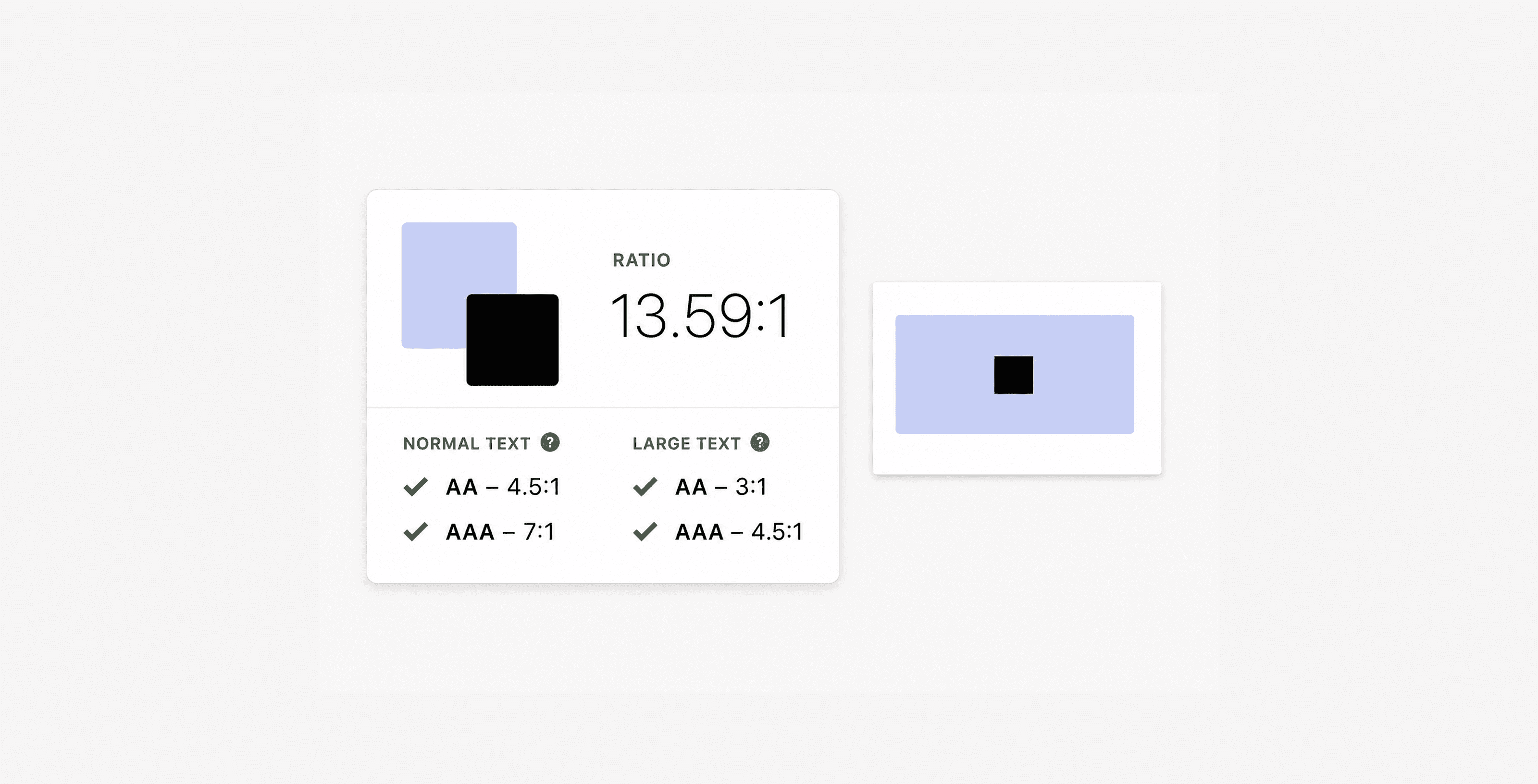
Sanitized reconstruction of the original validation artifact. The measured ratio and pass states are preserved; unrelated tool and product content has been removed.
A screen can pass a contrast check and still be difficult to use. Contrast did not tell me whether someone could understand the page structure, find the right region or recover after losing their place.
The first approach worked, but it could not ship
I started with Dark Reader, a browser extension that let users adjust contrast, font weight and color for themselves. The trial gave us a direction: users responded to stronger text and clearer separation between sections, and they valued being able to choose the treatment.
Then security rejected the extension.
Its page-level access, governance requirements and long-term attack surface were not acceptable inside the enterprise environment. Security was right. I had found a useful experience, but not one the company could safely own.
So I kept the useful part and changed the implementation.
The real problem was wayfinding
I went back to the testing evidence and watched how people moved through the interface. They were not only squinting. They were scanning across large, flat fields of information and losing track of where one section ended and another began.
The contrast complaint was real, but it was a symptom. The deeper problem was wayfinding.
What I shipped
I defined two options inside a user-controlled Accessibility modal.
Stronger text
A subtle treatment gave the existing 12px body type more perceptual weight without forcing a layout change across dense forms and tables.
Shaded cards
The component library already grouped related content into cards, but those regions were visually flat. A restrained background fill made each card a visible place on the page. Users could identify a section, work within it and find it again.
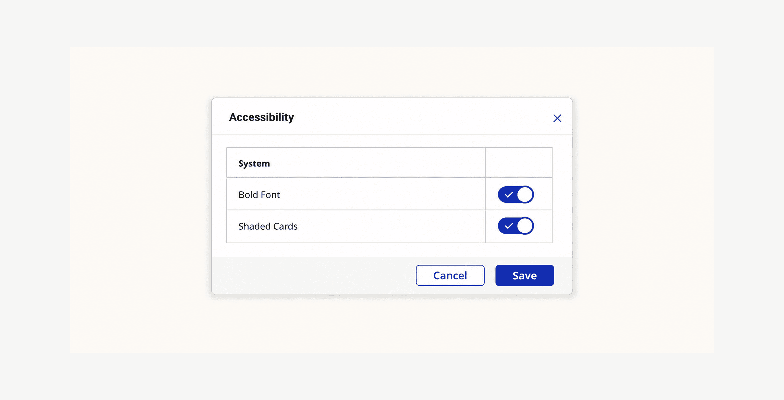
Sanitized reconstruction of the shipped production control. The labels and enabled states are preserved; the underlying product screen and identifying data have been removed.
I also aligned disabled-field colors that had drifted across implementations.
Stakeholders asked about dark mode. The users in testing did not. With limited engineering capacity, I kept the release focused on the controls that addressed what I had actually observed.
Making it workable across the platform
I worked with technical architecture and front-end development to fit the behavior into the existing component model and shared styling. It needed to help the users who needed it without forcing the treatment on everyone, work inside a fragmented 24-application ecosystem, survive security review and remain manageable for a small maintenance team.
The same preference model later expanded beyond the original two controls to include larger text, darker field and table boundaries, and selectable background treatments.
What changed
The accessibility options shipped into the live Cornerstone platform within six weeks.
Cornerstone had approximately 1,500 total users across the company's brand portfolio. That is the platform population, not the number of people who enabled the feature.
We did not have the user-level analytics needed to calculate adoption, return use or a clean before-and-after task result. I pushed repeatedly for event-level instrumentation. Datadog gave us system telemetry, but not the feature and behavior data I needed.
That missing number still frustrates me. It is also not a reason to invent one.
What I can support is the qualitative evidence:
The employees who had been struggling became informal advocates for the accessibility options.
In later conversations about unrelated UI problems, users were often already working with the options enabled.
Participants told us that stronger text reduced strain and shaded regions made the interface easier to navigate.
The low-vision participant's response confirmed that the spatial-landmark idea was addressing the real problem.
That informal advocacy mattered because groups did not naturally share practices across teams. I could see the options traveling through user conversations even though we did not have the analytics to quantify that behavior cleanly.
What this changed in my practice
Design-system decisions compound. The people who eventually pay for smaller type, tighter spacing and denser screens are usually not in the room when those tradeoffs are approved.
I now treat any system-level decision about type, contrast, spacing or density as an accessibility decision, even when the request is framed as efficiency or aesthetics. My job is not only to make the current release work. It is to understand what today's compromise will do across products, teams and years, and to push back when the cost is too high.
I also learned not to treat “no” from security, legal or platform as the end of the design. It is a constraint. Dark Reader helped reveal the right controls. The internal component pattern was the version the company could safely ship, maintain and extend.
What I would do differently
I would make event-level analytics part of the release requirement at kickoff. I would also raise the conversation sooner from “accessibility options” to “design-system health.” The fix helped users immediately, but the density decisions underneath it deserved a broader review.
Why this work stayed with me
This was not a polished redesign with a perfect analytics story. The evidence was imperfect, the first solution could not ship, and I had to confront decisions I had helped make.
That is why it meant something to me.
The work gave users control, made a live system easier to navigate and changed how I think about responsibility inside a design system. The most meaningful outcome was not a percentage. It was a user realizing that he could finally see where he was.
Have questions about the workflow, the prototype, or the design decisions? Happy to walk through it live.
Confidentiality Much of my work at The Estée Lauder Companies involved confidential internal platforms and cannot be shown in detail. This sanitized case study represents one part of a broader body of enterprise UX, design-system and product work.