

4
1
30+
3
Keep Pace
A ride-aware fueling assistant for cyclists
Project Overview
Most cyclists know fueling matters. The hard part is deciding what to eat, when to eat it, and whether what you brought is enough while already managing effort, traffic, terrain, power numbers, and fatigue.
Keep Pace turns ride context and the food riders already have into a simple, timed fueling plan. Before the ride, it helps riders build a practical plan from their own cupboard. During the ride, it keeps prompts simple enough to follow under effort. After the ride, it learns what worked and quietly improves the next plan.
The goal was not to create the most advanced cycling nutrition tool.
The goal was to create the easiest one to follow.
The Origin
I do not want to think about fueling. I just want to ride.
The project started with a pattern I knew well. Potatoes the night before. A banana before heading out. Gels, jelly beans, maple syrup mixed into water, caffeine somewhere along the way. Over years of riding, I had built a loose set of go-to foods that usually worked.
The problem was not that I did not know fueling mattered. It was that every ride asked me to make the same decisions again.
What kind of ride is this? How long will it really be? Is what I have enough? Should I bring another bottle? Should I eat now, or wait? And once the ride started, those questions were still there — competing with traffic, terrain, effort, and everything else happening on the bike.
I would often default to whatever was easy or within reach and hope it was enough. Sometimes it was. Other times, the consequence showed up gradually: a steady effort became harder than it should have, a familiar interval felt impossible, or the final part of a long ride turned into survival rather than riding.
That revealed the product problem.
Fueling failure rarely starts as a performance problem. It starts earlier, as a planning and timing decision left unresolved — then pushed into the ride itself, when it is hardest to make well.
Keep Pace began with a simple question:
How might we remove fueling decisions from the ride without asking riders to become nutrition experts first?
The Problem
Cyclists do not struggle with knowing that fueling matters.
They struggle with deciding what to do — and when — in the moment.
This is not a knowledge gap. It is a decision burden under physical stress.
Before a ride, the friction is planning. What should I eat? What should I bring? Is this enough? The cognitive tax feels disproportionate to the task, so riders default to whatever is convenient.
During a ride, the friction becomes execution. Should I eat now? Am I already behind? What do I have left? On an outdoor ride, those questions compete with cars, road conditions, braking, shifting, and other riders.
After a ride, there is rarely a feedback loop. You either felt good or you did not. There is no structured way to learn from what happened, so the same guesswork repeats.
The result: underfueling, inconsistent habits, and no repeatable strategy.
To validate this, I posted a discussion thread in r/cycling asking what riders actually carry on long rides — not what the nutrition guides say, but what is really in their pockets. The responses confirmed the pattern.
Riders described a duration-based mental model they had arrived at independently, without any app or guide:
"1 hour ride — just water. 1–2 hour ride — water plus a snack. 2+ hours — snack and electrolyte. 3+ hours — we are stopping for food. 4+ hours — we are STOPPING FOR LUNCH."
— r/cycling
That instinct is right. But translating it into a plan — and following through mid-ride — is where most riders fall short:
"I usually just end up overpacking 'just in case' snacks and then eat half of it in the first hour. The plan almost never survives past the first long climb."
— r/cycling
Riders do not need more nutrition information in the moment.
They need the decision removed.
Why Not Just…?
Before designing a new product, I tested the alternatives riders already use — from informal workarounds to dedicated endurance nutrition tools.
“Why not just ask ChatGPT?”
I tried this. I would ask for a fueling plan before a ride, get solid advice, and then never look at it again. The advice lived in a chat thread. It was not connected to my ride timing, my available food, or the moment I needed to act.
The insight: Static advice does not solve dynamic decisions. The problem is not generating a plan. It is delivering the right action at the right moment.
“Why not use EatMyRide or Fuelin?”
These are serious tools for serious riders. EatMyRide creates personalized nutrition plans using FTP, VO2Max, route data, Garmin integration, and real-time prompts. Fuelin supports broader nutrition coaching.
They work for riders willing to invest in them.
But that depth creates a barrier for another rider segment: the cyclist who wants to fuel better but does not want to pair devices, configure a product database, preload routes, or interpret carb targets before every ride.
These tools answer:
How should I optimally fuel this ride?
That is a valid question. It just is not the question Keep Pace is designed around.
Keep Pace asks:
What should I do right now with what I have?
Same domain. Different question. Different user. Different product.
Competitive Context
Existing tools prove the category is real, but often optimize for riders who are willing to manage setup, integrations, and detailed nutrition data. Keep Pace targets a lower-effort, adherence-first segment: riders who want guidance they can follow without becoming nutrition technicians.
The Opportunity
Design a system that eliminates decision-making by translating context into action.
Not:
What is optimal?
But:
What should I do right now with what I have?
The gap in the market is not “no one does cycling nutrition.” The gap is that many tools treat fueling as an optimization problem. Keep Pace treats it as a decision-elimination problem for riders who want simplicity above all else.
The opportunity is to serve riders who fall through the floor of more advanced tools.
Key Design Tension
Optimization vs. Familiarity
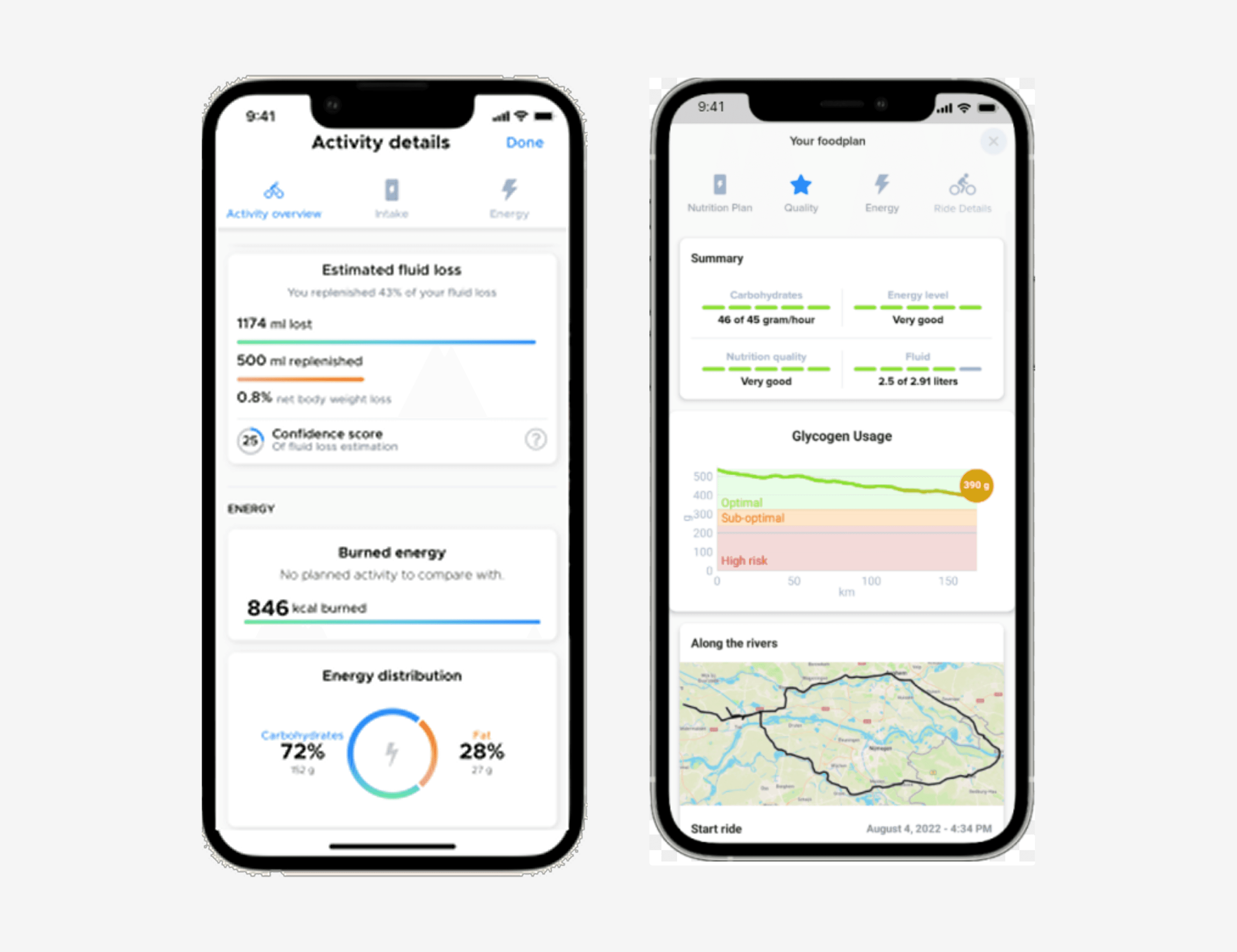
Early in the concept, I explored a more data-rich direction: precise carb targets, grams-per-hour tracking, optimized fueling curves, and ideal product recommendations.
It looked like a performance dashboard.
I killed it.
The problem was not that it was wrong. The problem was that it required the rider to interpret data while under physical stress. It also assumed ideal products instead of the bananas, fig bars, maple syrup, and PB&J actually sitting on the counter.
The decision: Familiarity over optimization.
Optimization Model | Familiarity Model | |
|---|---|---|
Accuracy | Precise | Practical |
Adherence | Lower — complex | Higher — simple |
Cognitive load | Heavy | Light |
Real-world resilience | Fragile | Resilient |
Strategic choice: adherence beats perfection. A plan you actually follow is worth more than a perfect plan you ignore.
Killed Concept

The killed concept: a performance-style dashboard with real-time gram tracking, burn forecasting, weather, altitude, power, and cadence. Every card was defensible in isolation. Together, they failed the rider in the moment that mattered most. More accurate data made the product worse.
The Cupboard Reframe
From “What should I eat?” to “What do I have?”
The original planning frame seemed obvious:
How might we help riders calculate what they need to eat during a ride?
Through exploration, the stronger frame became:
How might we help riders turn the food they already have into a ride-ready fueling plan?
Most riders do not think in nutrition categories while getting ready for a ride. They think in real-world inventory:
I have a banana. I have chews. I have maple syrup. I have two bottles.
The insight: riders know their cupboard better than they know their fueling model.
The research confirmed this across every community. When asked what they actually carry, riders described their kitchens — not nutrition categories:
"I generally don't use gels. Fig roll biscuits, make my own oat/nut bars, bananas."
— r/cycling
"Pitted dates in a silicone bag, roughly 4–6 per hour I expect to be out."
— r/cycling
"Refillable shampoo bottles with maple syrup."
— r/cycling
And from an indoor Zwift rider, who has their entire kitchen ten feet away and still reaches for the pantry:
"Aldi jam or marmalade by the spoonful."
— r/Zwift
Jam by the spoon is functionally identical to a honey packet or a maple syrup squeeze. The rider is not thinking in carbohydrate delivery mechanisms — they are thinking: I have this, it works, it is fast. The Cupboard model is built for exactly that reasoning.
Food Library
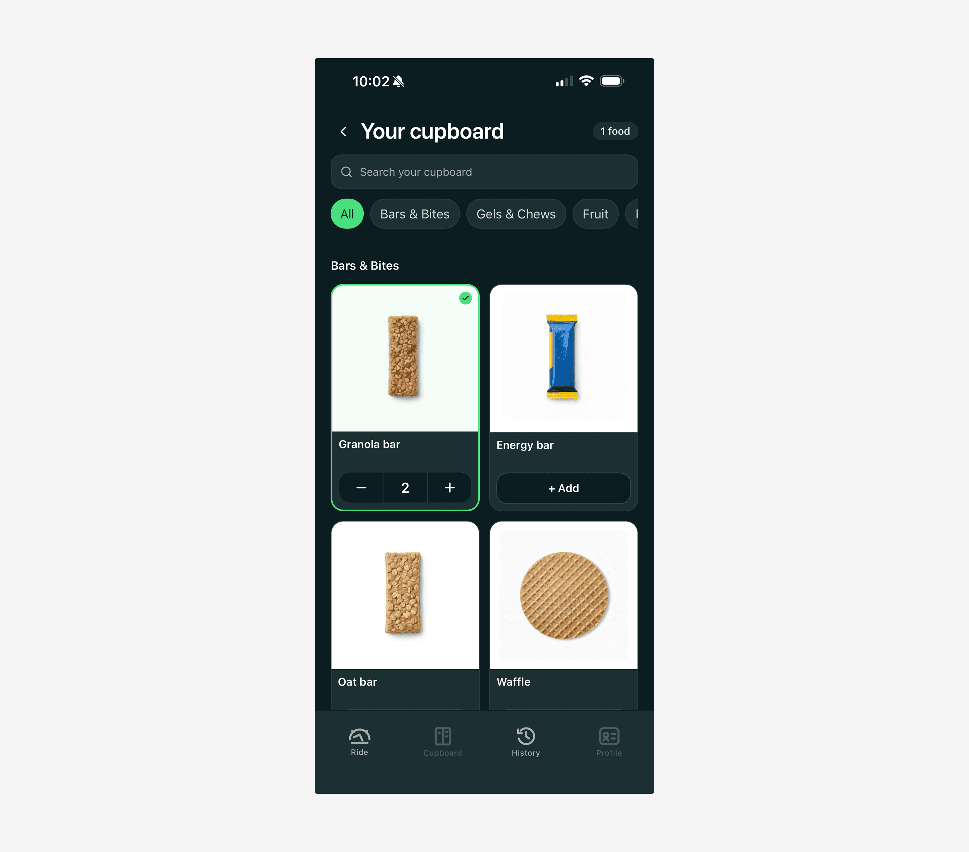
The cupboard library uses real foods, not nutrition categories. Riders see what they recognize; the system handles the classification behind the scenes.
How the System Hides Complexity
Instead of asking riders to choose “fast carbs,” “slow carbs,” or “carbs per hour,” Keep Pace asks:
What do you have?
The cupboard defaults to grocery-style categories — bars, gels, fruit, real food, snacks, drinks — because that is how riders think about their kitchen. Plain-language fuel roles like Quick fuel, Steady fuel, and Long fuel exist in the system, but they are introduced progressively through recommendations rather than forced up front.
Internally, every item carries both axes: a familiar grocery category for the interface and a fuel role for the planner.
This was an architectural tradeoff. Most teams would build nutrition-category selectors because that is what the underlying data wants. The cupboard model requires a translation layer mapping real foods to fuel roles — more engineering work, more edge cases, more responsibility on the system.
I chose the harder backend so the frontend could be simpler.
Three Planning Decisions That Shaped the Product
1. One plan, not three
The timing algorithm treats all selected items as one interdependent list, not separate schedules for fuel, hydration, and quick energy.
Items are sorted from slowest-release to fastest, then distributed across the ride window. Slow-burning food lands earlier. Fast fuel lands later. The rider never sees that logic.
An early version scheduled each food role independently and created timing collisions. One list, one window solved the problem.
2. Words over data
Early plan rows used mechanical labels like:
carries ~22 minutes
Accurate, but wrong in tone.
The better version used context-aware language:
Activates before effort peaks
Staying power across the long haul
The system still knows the math. The rider gets the meaning.
3. Session state vs. system state
The cupboard CTA originally turned green whenever items were selected. That worked in the linear path, but broke when a rider arrived from a recommendation. The button was already green, implying “you are done,” even though the rider had just been told something was missing.
The fix was to snapshot the item count on entry. The button stays quiet until the rider adds something new in that session.
An affordance should reflect what the rider has done in this moment, not what the system happens to know across all moments.
Design Principles
1. Zero cognitive load during effort
No numbers required mid-ride. No decision-making required. Only clear actions. If the rider has to interpret it, the design failed.
2. Familiarity over optimization
Use foods the rider already knows and has. Work with reality, not theory.
3. Absorb complexity, deliver simplicity
As the system matures — adding weather, ride history, and pattern recognition — it gets smarter without making the rider experience heavier.
4. Optimal first. Practical always.
The system aims for the best plan, but never blocks the rider when reality falls short. If the ideal food is not available, Keep Pace adapts, reorders, and explains the tradeoff in plain language.
Designing the In-Ride Screen
The in-ride screen is the product’s signature surface. It has one job:
Help the rider act without thinking.
Getting there took three distinct attempts.
Concept 1 — Card as Energy Canvas
Each food item was a vertical card whose background served as the absorption indicator. Fresh food filled the card with green. As digestion progressed, gray overlaid from the top down.
What worked: strong conceptual model.
What did not: background-based data was too subtle under physical effort.
Concept 2 — Progress Ring
The absorption indicator moved into a foreground progress ring around each food item.
What worked: faster scanning and clearer state recognition.
What did not: the larger system narrative — energy moving through the ride — became less visible.
Final — Hybrid System
The final design combined the strengths of both directions.
Element | Job |
|---|---|
Progress ring | Instant readability |
State chip | Human meaning: Full, Plenty, Half, Low |
Neutral card | Structure without noise |
Depleted stack | Past items recede without disappearing |
The ring gives the data.
The chip gives the meaning.
The card gives structure.
The depleted stack respects that not all information deserves equal visual weight.
I moved from designing a clever visualization to designing a usable decision system.
In-Ride Iteration

The final hybrid in-ride screen. The ring, chip, neutral card, and depleted stack each do one job. The result is less visually clever than the first concept, but far more usable under effort.
Two Details That Earned Their Keep
Stepped fills, not continuous gauges
The progress ring uses four discrete states — Full, Plenty, Half, Low — rather than a continuously animating gauge.
Continuous fill creates fuzzy interpretation: Am I still in Plenty? Am I almost Half? Stepped states remove that work. The absorption math still runs under the hood, but the rider sees a clear state.
Words over countdowns
The original up-next row showed a numeric countdown:
Up next in 14 min
A rider seeing that on the road noted that watching the countdown felt unnerving. As the system recalculated, the number could move: 14 → 12 → 9 → 11.
The number was truthful in a way that hurt.
The replacement used word-buckets:
Coming up soon
Coming up shortly
A little while yet
Later this ride
The adaptive engine stayed precise so the rider did not have to be.
The Visual System
Color in Keep Pace is not decoration. It is a performance variable.
The selected system uses deep teal as the primary surface, green for steady/on-track, amber for attention, and gray for depleted or past states.
One color is deliberately absent:
Red.
Not for missed prompts. Not for low water. Not for falling behind.
Keep Pace does not punish. Amber is the highest level of attention, and even amber is framed as information, not failure.
Food is shown as photography, not abstract iconography. Riders shop, plan, and eat in real foods, so the visual system stays in their world.
Visual System
Color was treated as a usability decision, not decoration. Deep teal creates a calm canvas; green signals steady progress; amber asks for attention without alarm; gray lets past items recede.
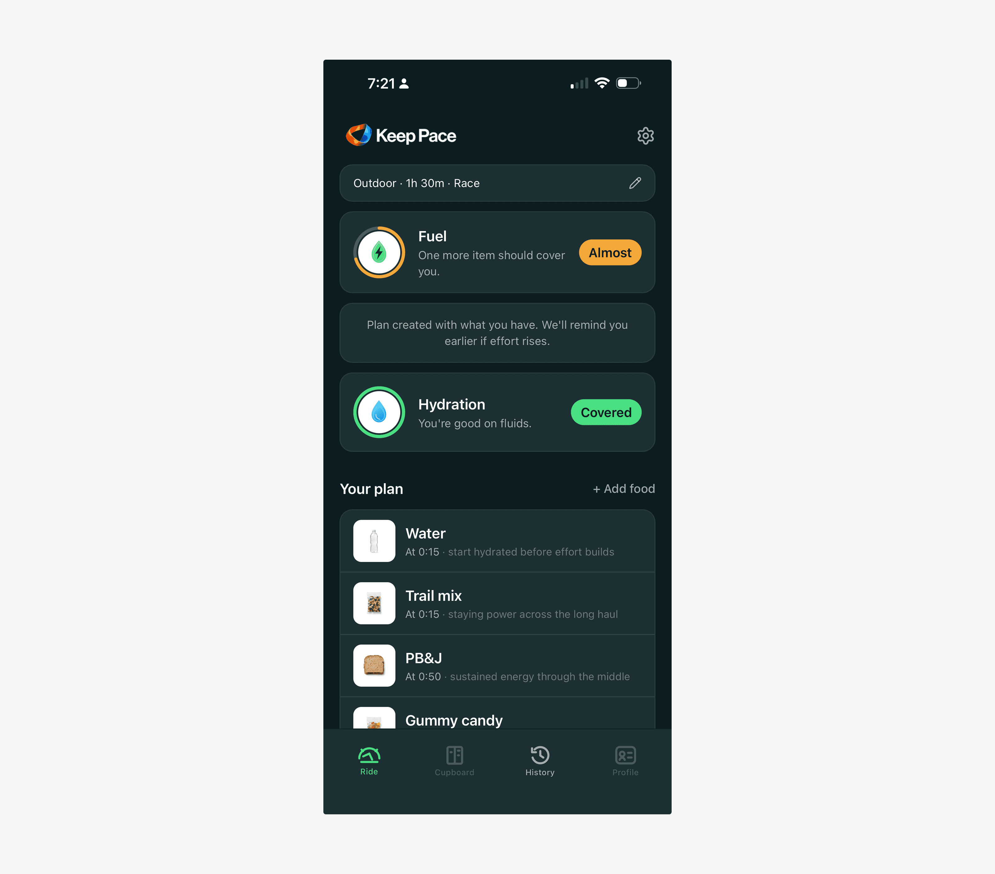
Core Experience
Plan
The rider tells Keep Pace three things: where they are riding, how long and how hard, and what food they have available.
Keep Pace generates what to eat before the ride, what to bring, and a timed plan for during. No account setup. No device pairing. No syncing. Open, answer, ride.
Execute
A single status word at the top of the screen — Steady — answers the rider’s most important question at a glance.
When it is time to eat, a bottom sheet rises with the food image, food name, and one clear action. If the rider confirms, timing is exact. If they do not, the system can infer the event and keep the plan moving.
Accuracy is available, but not required.
Reflect
The post-ride sequence does two jobs: acknowledge completion and capture enough feedback for the system to improve.
The post-ride headline adapts to the actual outcome:
You kept pace. — fueling stayed on track
You finished strong. — fueling dipped, but the rider completed the effort
Ride logged. — the rider ran low, and the system pivots to what it will adjust next
No shame for missed prompts. No grade. The system acknowledges what happened and moves toward the next improvement.
Ride Complete

The ride-complete moment closes the loop by reinforcing consistency and readiness for the next ride. The language stays calm and behavioral: fueling stayed steady, prompts were mostly followed, and the system has useful feedback for future plans.
The Insight Engine
Simple tools earn adoption. Intelligent tools earn loyalty.
Every lightweight reflection the rider gives is a signal. Every ride accumulates context. The insight engine turns that context into something the rider can feel — not a dashboard, but a plain sentence and a clear next action.
Signal + context + rider feedback → next useful adjustment
Examples:
Late effort got harder.
Your heart rate climbed while power stayed steady in the final 35 minutes. It was also warm, and hydration fell behind plan. Next time, Keep Pace will move your second bottle prompt earlier on warm steady rides.
Afternoon rides are your risk zone.
Your last three late-day rides showed lower prompt adherence and more fuel dips than your morning rides. Next time, Keep Pace will suggest a pre-ride snack before afternoon efforts.
Quick fuel saved the end.
You took chews before the final hard section and finished without a late energy dip. Next time, Keep Pace will keep a quick fuel item near the final third of similar rides.
Insights are not only corrective. A product that only tells riders what went wrong trains them to dread the summary. Confirmation insights are just as important because they tell the rider the system noticed and remembered.
The design constraint does not change as the system gets smarter:
Keep Pace does not surface more data because more data exists.
It translates data into the smallest useful adjustment for the next ride.
Product Evolution
Phase 1 — MVP
The core loop: plan a ride, get through it, reflect on it. Full pre-ride planning, in-ride guidance, and post-ride reflection. No integrations required.
Phase 2 — Context awareness
Strava integration, weather-aware planning, ride-type prediction, and better history patterns. The system starts absorbing context automatically.
Phase 3 — Adaptive intelligence
Learning from accumulated feedback, smart watch and headphone prompts, and dynamic mid-ride adjustments based on effort data.
The principle holds across all phases:
The system absorbs complexity so the rider does not have to.
The Fueling Guide
One pattern surfaced in the research that wasn't expected: a meaningful segment of riders actively suppressing fueling during rides because they believe skipping food accelerates weight loss. The instinct is internally coherent — eat less, burn more fat, lose weight faster. But it works against them in practice, and the evidence from both the r/cycling and r/Zwift communities confirmed that this is not a fringe behavior. It is one of the most common underfueling patterns in the rider population.
The logic playing out in their heads looks something like this:
If I don't eat on the ride, my body has to burn stored fat. Combined with the exercise, I'll lose weight faster.
It feels rational. The problem is that chronically underfueled rides reduce intensity, shorten sustainable effort, and increase fatigue — all of which reduce total energy expenditure over time. They are inadvertently making the exercise less effective in pursuit of a goal the exercise would support if they fueled it properly.
This is not a user Keep Pace excludes. It is the user Keep Pace can help more than they expect.
Two Distinct Rider Motivations
The research revealed that riders come to fueling with two meaningfully different goals. Most tools assume a single rider type — someone optimizing performance. But the rider population is split closer to two primary segments:
Riders who want to go faster and feel stronger. They want performance gains. Fueling is a tool for that outcome.
Riders who want to lose weight. They are using cycling for body composition goals. For this group, fueling is not intuitively connected to success — it feels like it conflicts with it.
These two riders need the same app, but they need different framing. The mechanics of good fueling are identical: eat enough to sustain the effort, time it well, hydrate consistently. But the why that motivates behavior is completely different.
Goal-Based Onboarding as a Design Response
That insight pointed toward a specific product concept: ask the rider's goal during onboarding.
What are you riding for?
— Get faster
— Lose weight
— Just enjoy the ride
The answer would not change the fueling mechanics — the timing algorithm, the cupboard model, and the plan logic stay identical. What changes is the framing throughout the app. A rider who wants to lose weight sees fueling connected to their goal from the start:
Fueled rides burn more total calories. Keep Pace helps you stay in the zone long enough for that to matter.
That is a fundamentally different message than Here is your next item due in 12 minutes. Both messages are true. Only one of them earns behavior change from a rider who has been skipping food on purpose.
The goal layer is not a separate app — it is a tone modifier. The minimum viable version of this does not require new logic. It requires new copy.
The Minimum Effective Dose
For the weight-loss rider, the biggest barrier is not information. They know the app works. The problem is the psychological leap from I eat nothing on rides to I eat according to a plan on every ride. That is a big first step.
The Fueling Guide is designed to close that gap before the rider builds their first plan. Not a manual, not a scolding — a knowledgeable friend explaining it over coffee. Why does fueling matter even on easy rides? Does eating on the bike work against weight loss? How do I know when to eat if I'm not hungry?
The guide earns trust in the framing before the rider commits to the behavior. That order matters: understanding why precedes following through on what.
Differentiation
Keep Pace does not aim to be the most scientific, the most optimized, or the most feature-rich cycling nutrition tool.
It aims to be the easiest to follow, the most practical, and the most usable under effort.
EatMyRide answers:
How should I optimally fuel this ride?
Keep Pace answers:
What should I do right now with what I have?
Same domain. Different question. Different user. Different product.
What This Project Demonstrates
Systems thinking
A closed-loop system — plan, execute, reflect, adapt — not just a set of screens.
Real-world UX constraints
Designing for physical stress, cognitive load, and divided attention.
Strategic judgment
Competitive analysis, explicit tradeoffs, and a clear rationale for rejected alternatives.
Craft judgment
A documented iteration arc on the signature screen: concept, test, refine, synthesize.
Behavior change design
A product that gets smarter through use, built on the principle that imperfect feedback collected consistently can outperform perfect data never captured.
Design philosophy
The best systems do not just give better answers. They remove the need to ask the question.
Tools & Process
Tool | Role |
|---|---|
Figma | Design — screens, flows, visual exploration |
ChatGPT | Strategy partner — product framing, case study development, UX critique |
Claude | Logic and build partner — prototype structure, React support, interaction logic |
Figma to code conversion | |
Lovable Pro | Live prototype build |
Cloudflare | App hosting and deployment |
Framer | Portfolio site and case study presentation |
Reflection
This project reinforced that the most advanced product is not always the one that exposes the most intelligence. In endurance sports, more data can easily become more work — especially when the rider is already under physical stress.
The most important design move was not adding features. It was deciding where complexity should live.
If I continued this work, I would test four assumptions next:
Whether riders understand and trust the cupboard-first model without nutrition education.
Whether word-based timing feels calmer than numeric countdowns during actual rides.
Whether post-ride reflection can capture enough signal without becoming another chore.
Whether goal-based onboarding meaningfully changes adherence for the weight-loss rider segment — specifically, whether framing fueling as supporting their goal is enough to shift behavior, or whether the psychological barrier requires something more direct.
The next product risk is not whether Keep Pace can create a plan. It can. The risk is whether the product can earn repeated use without feeling like another thing to manage.
That is the standard I would use for the next round of testing: not just does it work? but does it stay light enough to become a habit?
Have questions about the workflow, the prototype, or the design decisions? Happy to walk through it live.