

2
3
5,800
3
TL;DR
I joined a complex R&D engagement cold — no domain background — and was asked to help shape a future internal tool for raw-material replacement, the workflow that gets triggered every time a regulator restricts an ingredient and dozens of formulas need to change at once.
In about three weeks I:
Attended two workshop days alongside scientists, R&D operations, and brand R&D leads — listening, asking UX questions where I could, and capturing how the work actually happens today.
Synthesized the workshop content into a UX discovery readout, an opportunity map sequenced across five phases of UX maturity, and a five-step user flow.
Built a 5,800-line working React prototype using an AI-assisted workflow, despite not being a coder.
Ran three Usability Forums against the prototype with real formulators and brand R&D leads, then iterated.
The prototype was conceptual — it was never meant to ship — but it was interactive enough that scientists could actually do their work in it, which is what made the feedback honest. The output of the engagement was a validated UX direction, a set of design principles, and a phased roadmap the product team could take to engineering.
This case study is mostly about how I did this. The interesting story isn't the artifact. It's the workflow that got a non-coder Principal UX Designer to a real working prototype in three weeks, what AI did well, and where human judgment had to step in hard.
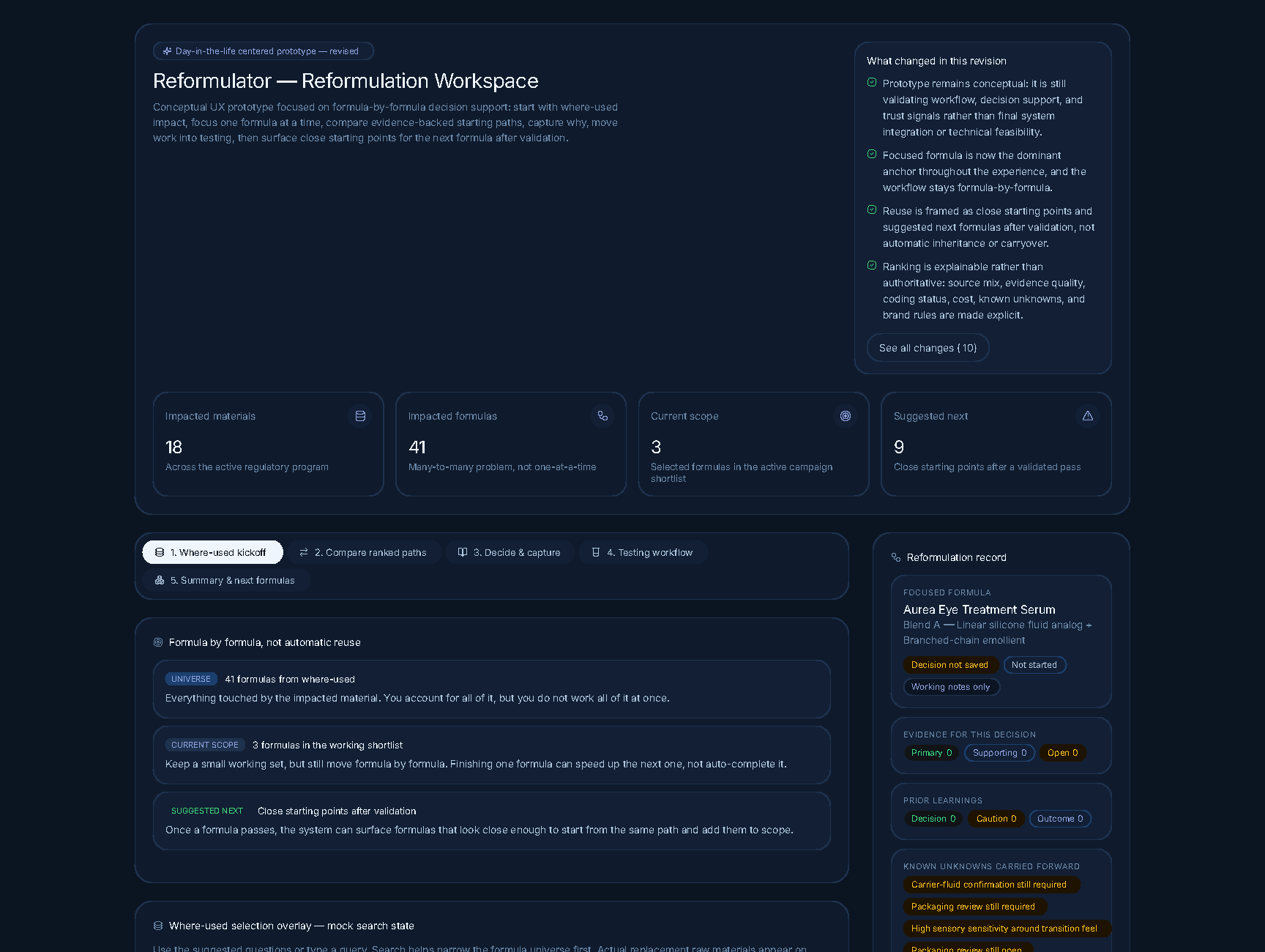
The landing view. Scope is shown before search — and what's changed in this revision is given the same visual weight as the active work.
The problem
Lumera Beauty Group makes prestige skincare and makeup across multiple brands — luxury (Aurea, Marquise), clinical (Veridian), botanical (Wildroot), and a few more. Like the rest of the industry, they reformulate constantly: regulators restrict an ingredient, a supplier discontinues a material, sustainability targets force a change. Every restriction event ripples across dozens of SKUs.
The specific trigger in this engagement was a fictional EU material-restriction directive on volatile carriers — the kind of broad, class-level restriction that lights up a long list of products simultaneously and forces the R&D org into "find substitutes for everything affected, fast" mode.
The current state was hard:
Impact analysis was manual and serial. Scientists looked up one material at a time across multiple internal systems (a master Materials Index, a Formula Repository, a Material Coding Service, plus suppliers, plus external databases).
Replacements are rarely 1-to-1. Most substitutions are blends, and they ripple — change one component and the formula's sensory profile, stability, and packaging compatibility shift with it.
Reasoning evaporated. Decisions got made, products shipped, and the why — the trade-offs, the rejected paths, the failures — never made it back into a system anyone else could learn from.
The hardest decisions live in expert heads. A small number of senior formulators carried disproportionate load and got asked the same questions, year after year, by new scientists who couldn't see the precedent.
That last point became the central insight. The pain wasn't that the systems were dumb — it was that the systems stored records while scientists thought in scenarios.
The constraint that mattered
I had no domain knowledge coming in. I'd never been near a beaker. I had to learn enough chemistry, regulatory context, and R&D operations to be useful — and I had three weeks before product wanted a direction to take to leadership.
This is the constraint that made the AI-assisted workflow worth it. Without it, I'd have spent the first week trying to build vocabulary by reading. Instead, I used AI as a way to interrogate workshop transcripts faster, generate hypotheses I could pressure-test with experts, and draft prototype scaffolding from synthesis documents that I'd otherwise have had to hand off and wait on.
The trade-off, which I want to be honest about: AI is happy to generate confident-sounding nonsense in a domain it doesn't understand. The whole engagement was a discipline of not letting that ship. I'll come back to this.
The opening framing of the engagement set the bar. From day-one program leadership in the workshop:
"We had a magic button project, most of you know, that delivered some automation. But when I took over and asked the question — what does success look like? — nobody could answer that. Let's not repeat the magic button." — Day-one workshop framing, paraphrased
That sentence did more work than any kickoff brief could have. The ask wasn't automation. The ask was trust under uncertainty.
The workflow
I want to walk through this in detail because the workflow is the case study. Five distinct phases, each with a specific output and a specific role for AI.
Phase 1 — Listening: workshops as raw material (Week 1)
I attended two workshop days as the UX lead — a Day 1 framing-and-as-is session and a Day 2 solutioning session. The room had senior formulators, mid-level scientists, R&D operations, and brand R&D leads. My job in those sessions was to listen, ask UX-shaped questions where I could, and capture the texture of how the work actually happens. I did not run the workshops; the program team did. My role was to absorb.
I went in with no agenda beyond "describe how reformulation actually works today." No personas, no frameworks. Just the as-is process, the pain, what success would feel like.
A few moments stuck out from the transcripts and chat as the engagement progressed. From a senior formulator:
"My only gripe here is the inherit portion. It almost seems like they have to move forward with it. I think we have to give it a little more leeway there in terms of: this is a great starting point." — Said by a senior formulator while watching the prototype in action.
That line — caught later in usability — was the one that quietly reset everything I thought I'd designed. I'll come back to it.
Phase 2 — Synthesis (Week 1–2)
This is where AI started carrying real weight. I fed workshop transcripts and chat logs into Claude and asked it to surface pain points, what users said vs. what users did, and recurring tensions across sessions. I cross-checked everything against the source. Some of what came back was sharp; some of it was blandly correct in a way that didn't actually advance the work; a small but important fraction was confidently wrong.
The discipline I developed: AI synthesis is a draft-zero, never a final. Every insight got traced back to a transcript timestamp, paraphrased into my own words, and pressure-tested against what I'd heard in the room. The synthesis I shipped — pain points, opportunity areas, cross-cutting themes — was AI-accelerated but human-owned.
The output of this phase was a UX Discovery readout grounded entirely in workshop content. Three proto-personas (senior expert, mid-level formulator, new scientist), ten pain-point clusters, and a one-line synthesis that drove everything downstream:
Cognitive load is the bottleneck, not lack of intelligence or effort.
Two sub-points that came directly from the formulator voice:
"Past tools struggled when they appeared too certain or too magical." — The most valuable information, formulators said repeatedly, is why something was selected, why others were rejected, what risk was accepted, what failed, what was learned.
"Failed paths are valuable but usually lost." — Organizations preserve successful outcomes and lose abandoned directions. That causes repeated work and repeated mistakes.
Phase 3 — Opportunity map (Week 2)
I translated the synthesis into a phased opportunity map — five phases of UX maturity, from "help me get oriented" to "help expertise travel farther." This was deliberately not a feature list. It was a sequence of changes in user value, mapped against what a roadmap could realistically deliver.
The framing I landed on was that Reformulator should evolve from a system of record to a system of reasoning, learning, and confidence. That single line did more work in stakeholder conversations than any of the other artifacts.
This phase was mostly old-fashioned synthesis work. AI was useful for stress-testing — "what's missing here, what would a skeptic say." But the structure was mine.
Phase 4 — Prototype (Week 2–3)
Here's where the workflow got unusual.
I'm not a coder. I can read TypeScript, I can break a small React component, but I cannot write 5,800 lines of TSX from scratch. What I can do is design with a level of specificity — component-level annotations, state behavior, copy, edge cases — that gives an AI partner enough to work from.
The prototype came together as a sustained back-and-forth:
I'd describe a screen and its states (where-used kickoff, ranked candidate paths, the decision capture moment) at the level I'd normally write Figma annotations.
AI would generate a working component and the state plumbing.
I'd run it, find what felt off, and iterate — usually on copy, hierarchy, or interaction, not on plumbing.
Repeatedly: I'd catch AI inventing data structures or plausible-sounding domain logic that didn't match what I'd heard from scientists, and I'd correct it.
By the end I had an interactive prototype that walked through:
Where-used kickoff — orient first. Show what's impacted, with explicit data confidence indicators ("partial," "supplier confirmation needed") instead of silent failures.
Compare ranked paths — replacement scenarios, not single-ingredient swaps. Paths are stacked vertically as full-width cards, ranked top to bottom, with the same template across each: source mix, evidence quality, brand fit, cost delta, sensory risk, coding status, real-usage data from similar contexts, and reasons-up / reasons-down for the ranking. Comparison happens through compare-as-you-scroll, not at-a-glance columns — the depth of evidence per path is what matters.
Decide and capture rationale — lightweight inline prompts that turn decision-making into reusable knowledge. "Why selected. Why others rejected. Known risks." Not extra documentation; a finishing-the-thought moment.
Testing workflow — capture pass/fail learning from the lab without forcing duplicate manual entry into the existing systems.
Summary and next formulas — once a path is validated, surface close starting points for the next formula. Explicitly framed as starting points, never auto-apply.
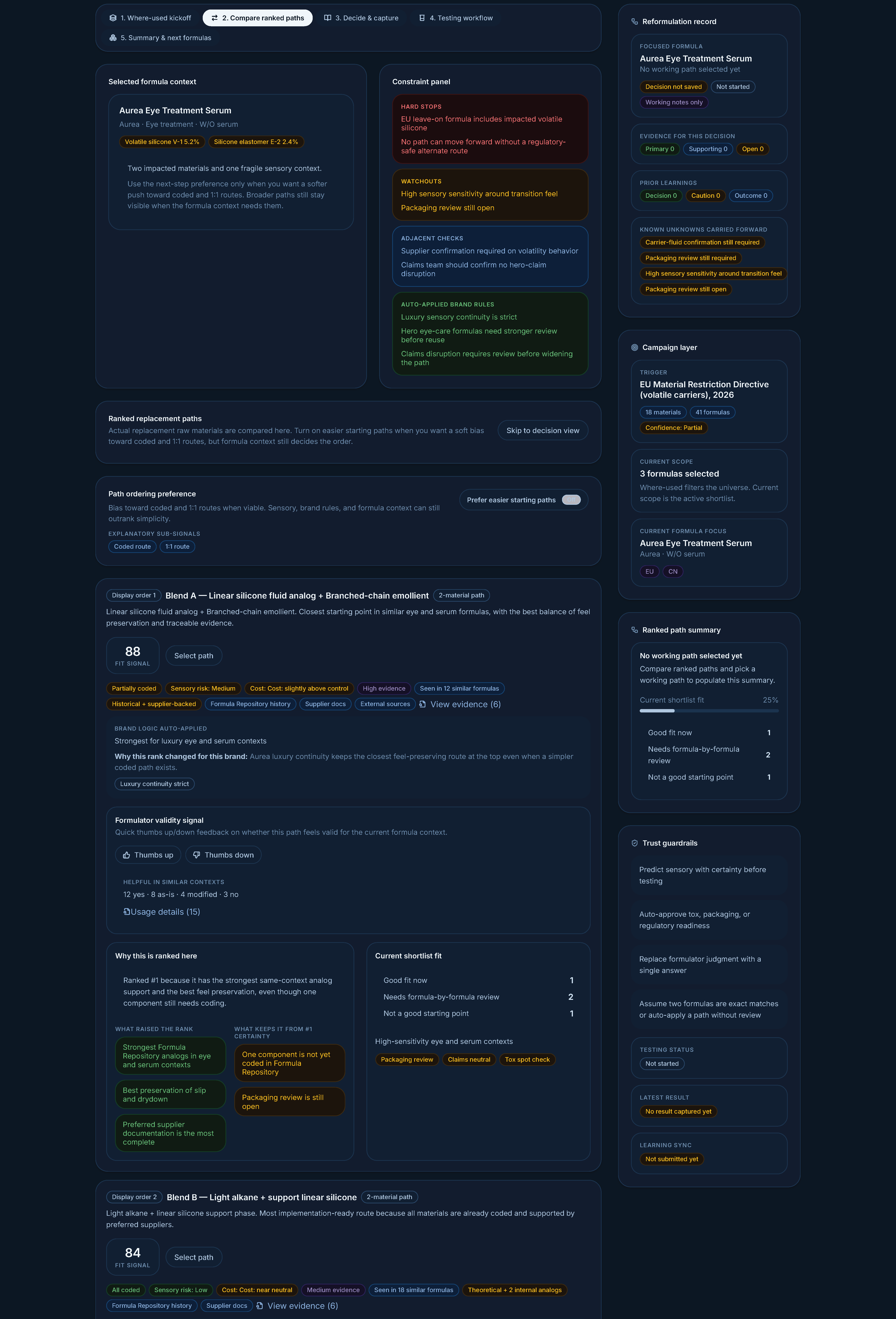
Replacement paths stacked vertically with the same template across each card. Comparison happens through compare-as-you-scroll, not at-a-glance columns — depth of evidence per path comes first.
A specific example of where AI confidence had to be reined in: my first prototype draft used the language "Recommended replacement." That copy came out of AI fluency — it sounded right. It would have torpedoed the project. The whole synthesis pointed at scientists not wanting a system that issued recommendations they'd then have to argue with. The corrected language became "Common starting points in similar scenarios" and "Suggested next formulas — still requires formula-by-formula review." Same UI, completely different relationship between user and system.
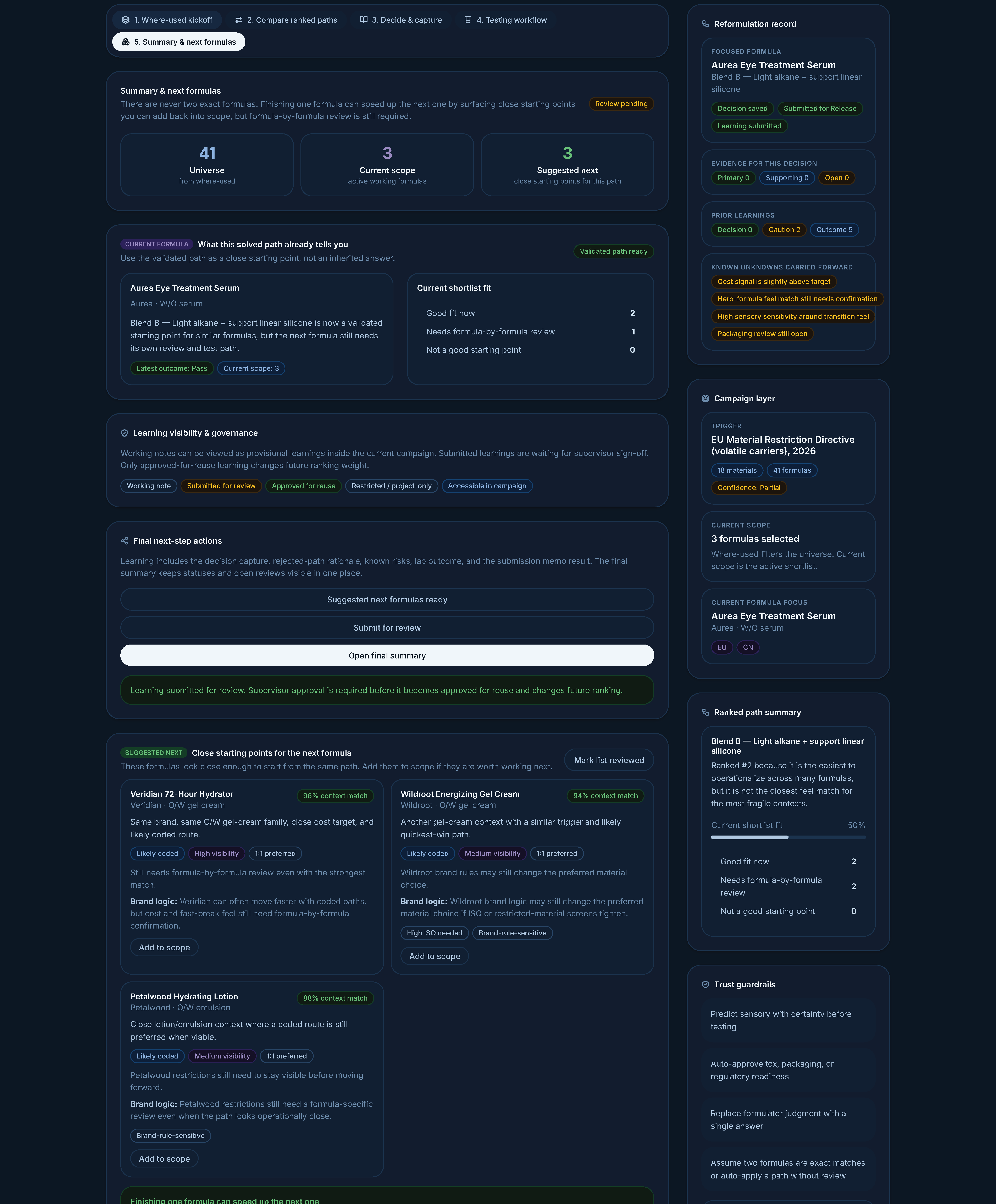
"Close starting points for the next formula." Reuse is the result of validation, not a default. Suggested-next stays gated until a real pass.
That kind of correction is the actual job. AI accelerated the building; the judgment about what not to ship was still mine.
Phase 5 — Three Usability Forums (Week 3)
I ran three Usability Forum sessions against the live prototype with senior formulators and brand R&D leads. Because the prototype was actually interactive, sessions weren't "look at these screens" — they were participants doing work.
A few moments I'll keep, all verbatim from the session transcripts:
A senior formulator on the brand-context layer, when I demonstrated how a replacement might apply across other formulas:
"The architectures of the different formulas do produce some differences. If it works for formula A, you still might have to adjust it slightly for formula B because there are other ingredients that are interacting with this entire system."
A brand R&D lead on why "applying the same path across formulas" needs care:
"Just because, let's say, two different formulas have the same material you're trying to swap out, it doesn't mean that the solution is going to be the same for both of them, in essence."
A senior formulator on sensory uncertainty — exactly the "transparency over false certainty" idea, in his own words:
"You and me can feel the exact same formula. Your perception might be this is an exact match. I might find a slight difference depending on, you know, our own personal evaluations."
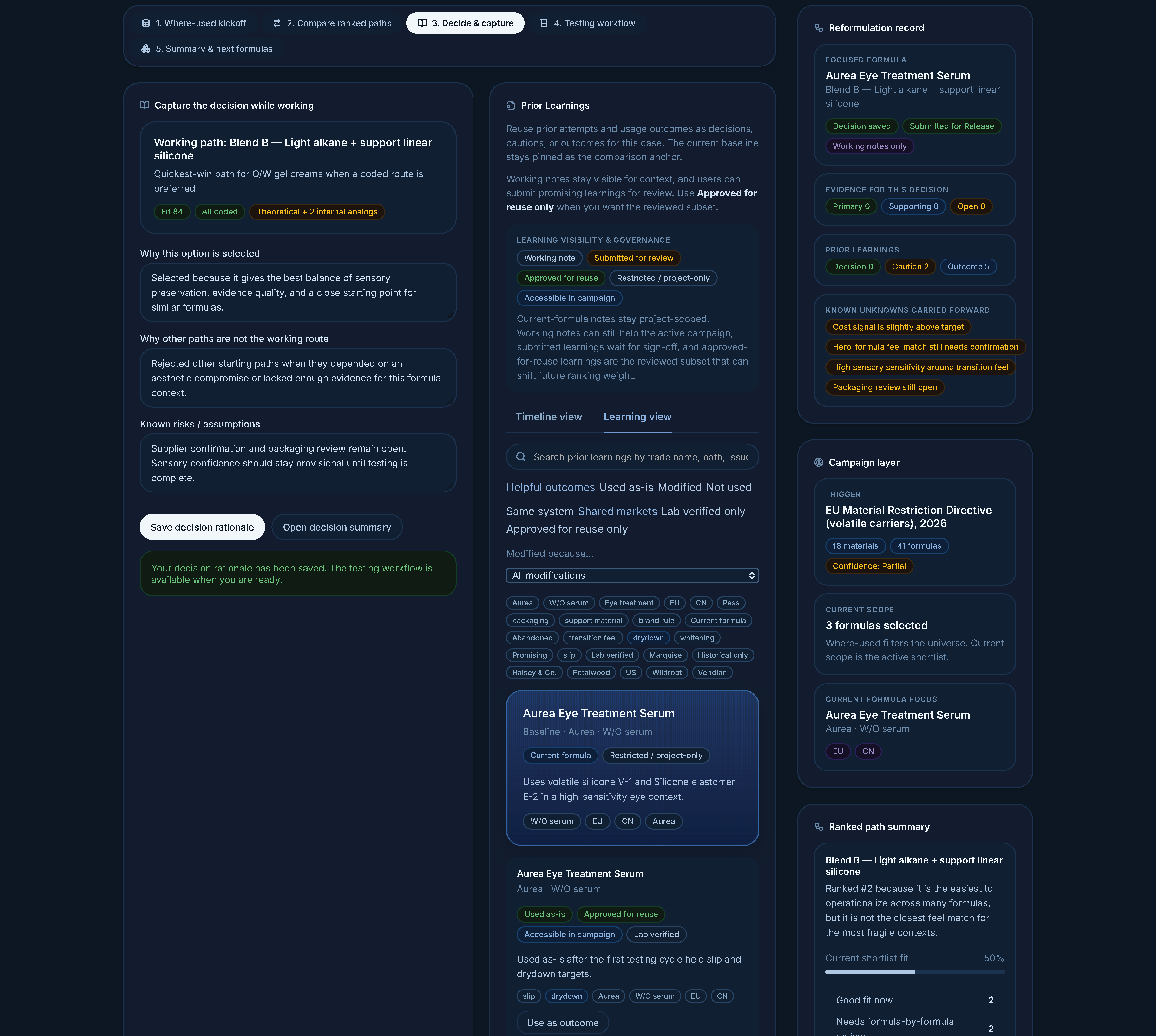
Rationale capture lives at the decision moment, paired with prior-learning context. Documentation feels like finishing a thought; comparable past work is one tab away.
The Forums also surfaced things I'd missed:
The "stopped / abandoned" path needed to be a first-class outcome with reason capture, not an edge case. I'd treated it as a failure state. To scientists, an abandoned path is learning, not failure.
The samples-only path for downstream submissions wasn't represented. From a brand R&D lead: "A lot of times we're submitting samples to them and we're not looking for an approval. It's just because they requested samples of something." Real lab work isn't always toward a final formula — sometimes you're just sending pieces.
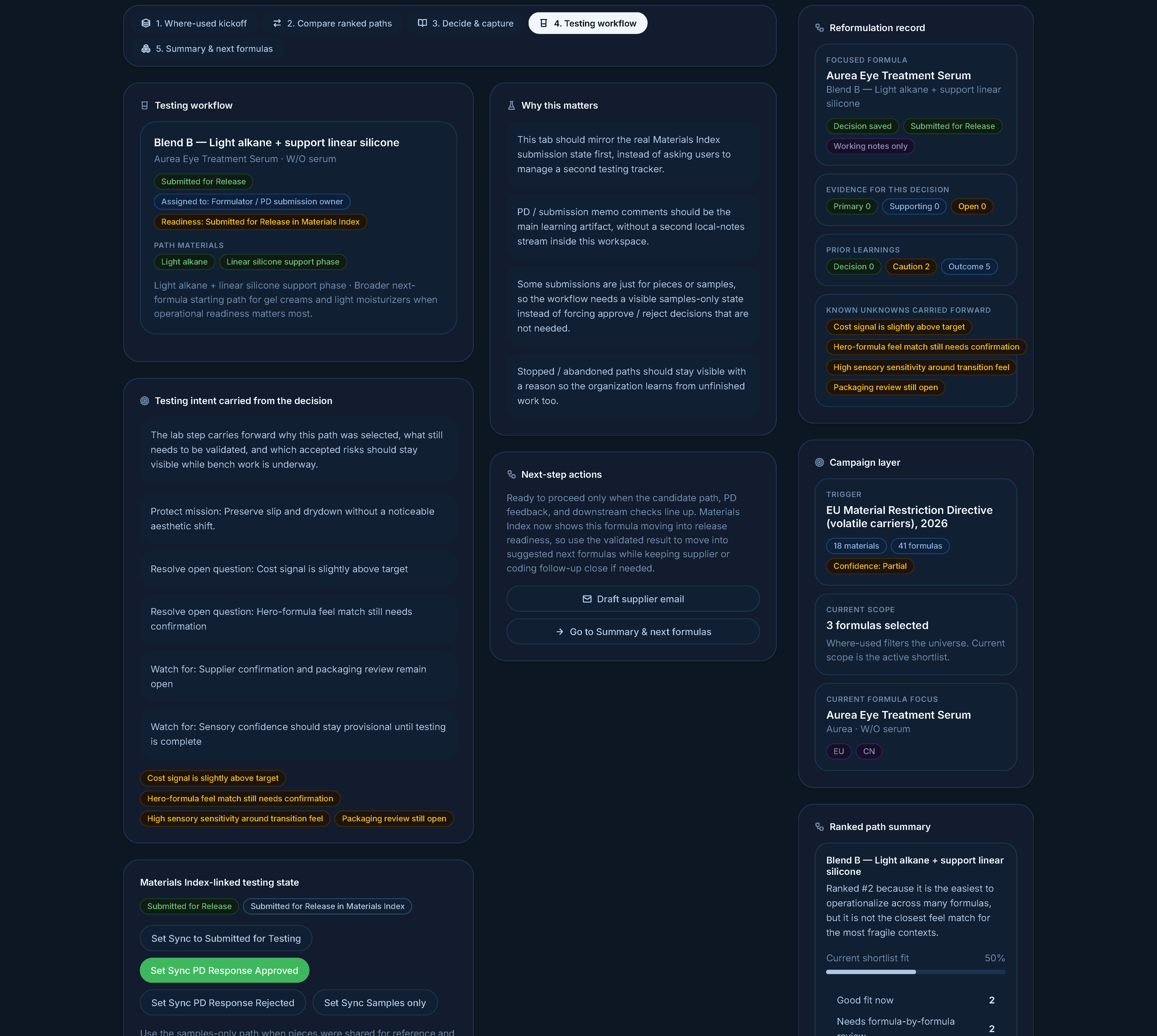
Lab work inherits decision rationale and accepted risks from the previous step. A samples-only path exists for submissions where no approve/reject is expected — abandonment becomes a first-class outcome.
I rev'd the prototype between Forums and shipped a final revision that addressed both.
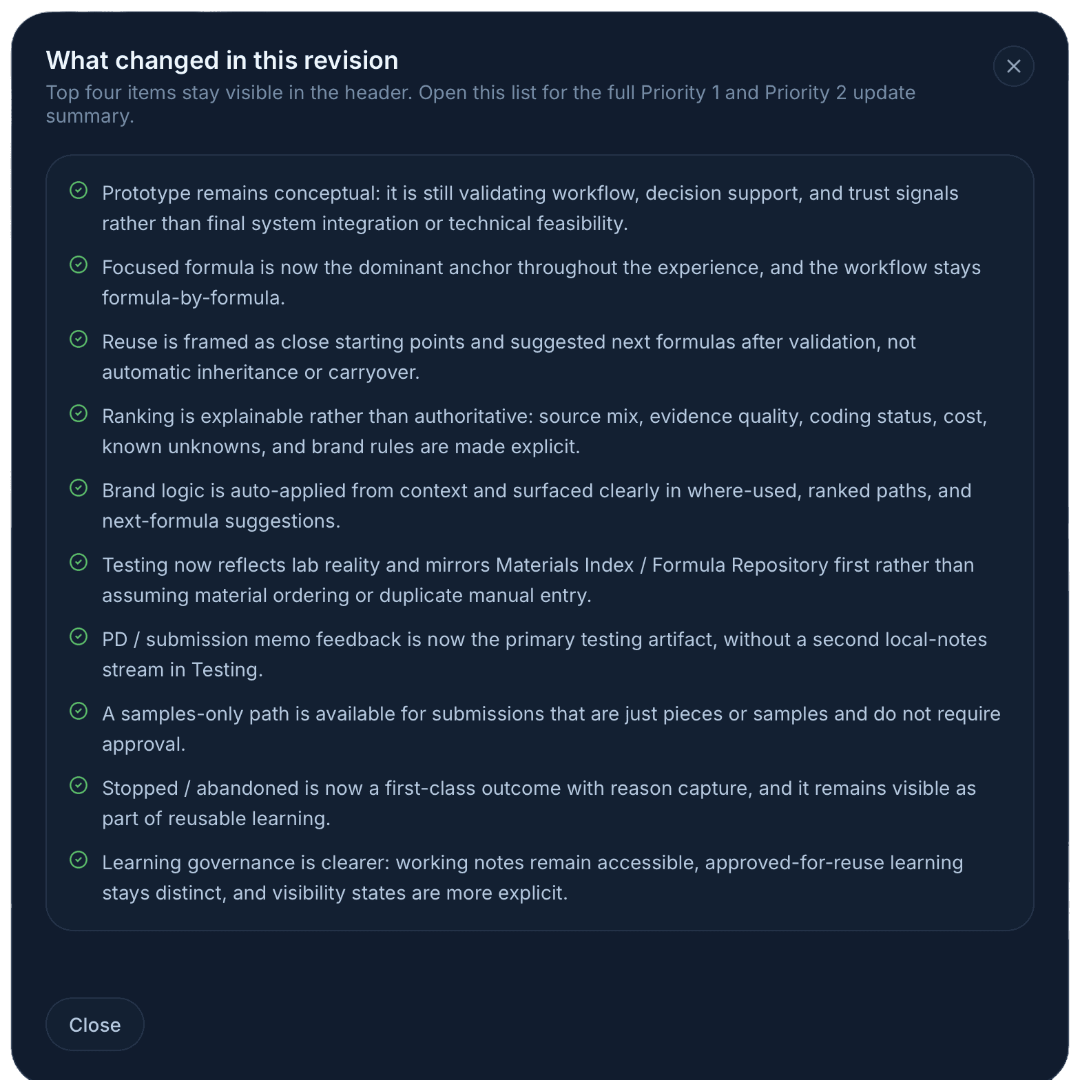
The prototype kept a visible revision log of its own. Every entry traces back to a synthesis insight or a Usability Forum moment.
The prototype itself wasn't deployed. It wasn't supposed to be. It was a vehicle for getting to a validated UX direction faster than a static-mockup-plus-deck approach would have.
What this proves about the workflow
I want to be careful here, because there's a lot of breathless content about "AI made me a 10x designer" and most of it is wrong. Here's what I actually think this engagement demonstrated:
AI made the prototype feasible at all. Without it, the engagement output would have been a deck plus mid-fi Figma frames, which is what most discovery work produces. With it, scientists got to use a prototype, and the feedback was correspondingly sharper. That's a real change in design fidelity at the discovery stage.
AI did not replace any of the senior judgment. The synthesis call, the framing call ("system of reasoning, not system of record"), the language call ("starting points, not recommendations"), the decision to make abandoned paths a first-class outcome — those came from listening to the workshop and from sitting with the material. AI couldn't have made them; it did the opposite of make them on the first pass.
The skill that scaled was specificity. The reason AI could generate a usable prototype is that I was specifying screens at component level — states, copy, edge cases, hierarchy. Designers who work that specifically already had this skill. Designers who hand vague briefs to AI tools get vague output back. The bar for senior design hasn't dropped; the leverage has gone up for designers who already cleared it.
The discipline that mattered most was distrust. Every AI output got pressure-tested. Synthesis got traced to source. Generated copy got compared against what I'd actually heard from users. Generated logic got challenged on whether it matched the domain. The case study is real because the discipline was real.
Design principles I'd bring to the next thing
These came out of this engagement specifically but generalize to most decision-support tools:
Orient first, search second. Don't drop users into a blank query box for a problem they don't yet understand the shape of.
Make uncertainty legible. Missing data, partial confidence, supplier-pending — these belong in the UI as first-class signals, not silent absences.
Support thinking; don't issue verdicts. Decision support is a different product from decision automation. The language and hierarchy must reflect that.
Capture rationale as a byproduct of work, not as documentation. If "save your reasoning" is a separate task, it doesn't happen.
Treat learning as a first-class outcome. Failed and abandoned paths are organizational memory, not edge cases to hide.
Trust grows from explainability, not accuracy. Scientists didn't need the system to be right. They needed it to show its work.
A correction I caught after the fact
The most useful thing I learned in this engagement didn't come from a workshop or a Usability Forum. It came from sitting with the synthesis afterward.
The prototype scored well in the Forums — scientists worked in it, gave concrete feedback, and steered the next revision. But in the post-Forum review, I noticed a gap between what the design said and what the design did. The whole thesis was decision support, not decision automation. The language in the prototype was deliberate: common starting points, formula-by-formula review still required, suggested next, not auto-applied. None of that conceded any ground to a "winner" pattern.
Except in one place: when the user landed on the compare step, the system was preselecting the highest-fit-score path. The card at the top of the stack showed a green Selected path button. Cards 2, 3, and 4 said Select path. The visual state was unambiguous — we already chose for you.
I had this feedback in plain English from the Forum and I almost missed it.
"My only gripe here is the inherit portion. It almost seems like they have to move forward with it. I think we have to give it a little more leeway there in terms of: this is a great starting point." — Said by a senior formulator while watching the prototype in action.
He wasn't disagreeing with the ranking. He was rejecting the premise that a ranking should produce a default selection. Each path carried different work and different risks. The right path depended on the formula, the brand, the deadline, the appetite for sensory risk — judgment calls a single fit score can't make. The "inherit" language and the auto-preselection together communicated that the system had already decided. That's the gap I'd missed in my own design.
The auto-preselection was a small holdover from a recommend the best one instinct that the rest of the design had already moved past. It wasn't a glaring bug. It was the kind of subtle inconsistency that's only visible if you're willing to read your own design against your own research after the fact.
The next iteration removes the preselection. The user lands on the compare step with no path chosen. All four cards read Select path. The decide, testing, and summary steps are gated until the user makes a deliberate choice. Ranking stays as a tool — order communicates a starting hypothesis — but the choice belongs to the scientist. It's a one-line state change in the code and a fundamental change in stance.
I'm including this in the case study deliberately. Most design portfolios tell a triumphant arc: identified the problem, built the right thing, users loved it. The work I'm actually proud of looks different from that. It looks like noticing, weeks after a successful Forum, that the design was still subtly contradicting itself in a way the research had quietly pointed at. The discipline isn't shipping the perfect first version. It's being willing to keep pressure-testing after the applause.
Reflection
The thing I'm proudest of in this engagement is the language in the final prototype. Every word was earned. "Common starting points in similar scenarios." "Still requires formula-by-formula review." "Reason for stopping." Those aren't AI outputs. They're the residue of a lot of careful listening, and they're the part that determined whether scientists trusted the tool or tuned it out.
The thing I learned that I'll carry forward is the workflow itself. I'll never again do a discovery engagement that ends in static mockups when I can get to an interactive prototype in the same time. The fidelity of feedback you get from people doing the work in a prototype is qualitatively different from what you get pointing at frames. AI is what made that affordable for a non-coding designer.
And the part I'll keep being honest about is the failure mode. AI fluency is a hazard, not a gift. The version of this engagement where I trusted the first AI synthesis and shipped a tool that "recommended replacements" would have been a clean failure. The version where I shipped what I shipped is, I think, a real piece of design work. Same tools, completely different output, because of where the human judgment sat.
Deliverables
Research synthesis — workshop pain points distilled into ten pain-point clusters with design implications, plus a phased UX opportunity map across five maturity levels.
"Day in the Life" narrative — the primary persona's reformulation flow, used by stakeholders to sanity-check whether the proposed UX matched real work.
5,800-line interactive prototype — built with an AI-assisted workflow; scientists pressure-tested it directly in three Usability Forums, with a visible revision log between iterations.
Design principles that outlived the prototype: orient first, expose uncertainty, support thinking over automation, capture rationale as a byproduct, treat learning as a first-class outcome.
Have questions about the workflow, the prototype, or the design decisions? Happy to walk through it live.
A note on confidentiality — This case study is based on real work conducted under NDA at a prestige beauty company. Brand names, product names, internal system names, ingredient codes, regulatory program references, business figures, and participant names have all been replaced with fictional equivalents. Direct quotes from research participants are paraphrased for the same reason — the substance is preserved, the source is anonymized. The methodology, design rationale, UX patterns, and reflections are my own.