

At a glance
Role
Product / UX Designer
Product
Solen, an independent, non-clinical concept for carrying a complex health history into the next care conversation
Team
Solo designer
What I owned
Exploratory research, product strategy, information architecture, interaction and visual design, prototyping and iterative usability testing
What I delivered
A working prototype that turns fragmented history into patient-readable threads, specialist context and appointment preparation. The findings are directional, not clinical outcomes.
8
1
4
4
The problem
For people navigating complex, unresolved, or multi-system health concerns, care can become a long sequence of specialists, tests, medication changes, procedures, portals, and explanations repeated from memory.
Each clinician may be working appropriately within their own scope. But when no one holds the full history, the patient becomes the integrator: locating old results, translating one clinician's language to another, remembering what failed, and deciding what matters in a short appointment.
The design challenge wasn't simply to organize health information. It was to answer a harder question:
How might we help someone carry the right context into the next appointment without pretending the product can diagnose them?
Solen is a speculative concept for that missing layer. It doesn't diagnose, recommend treatment, or replace clinical judgment. It helps people make their history easier to understand, discuss, and carry forward.
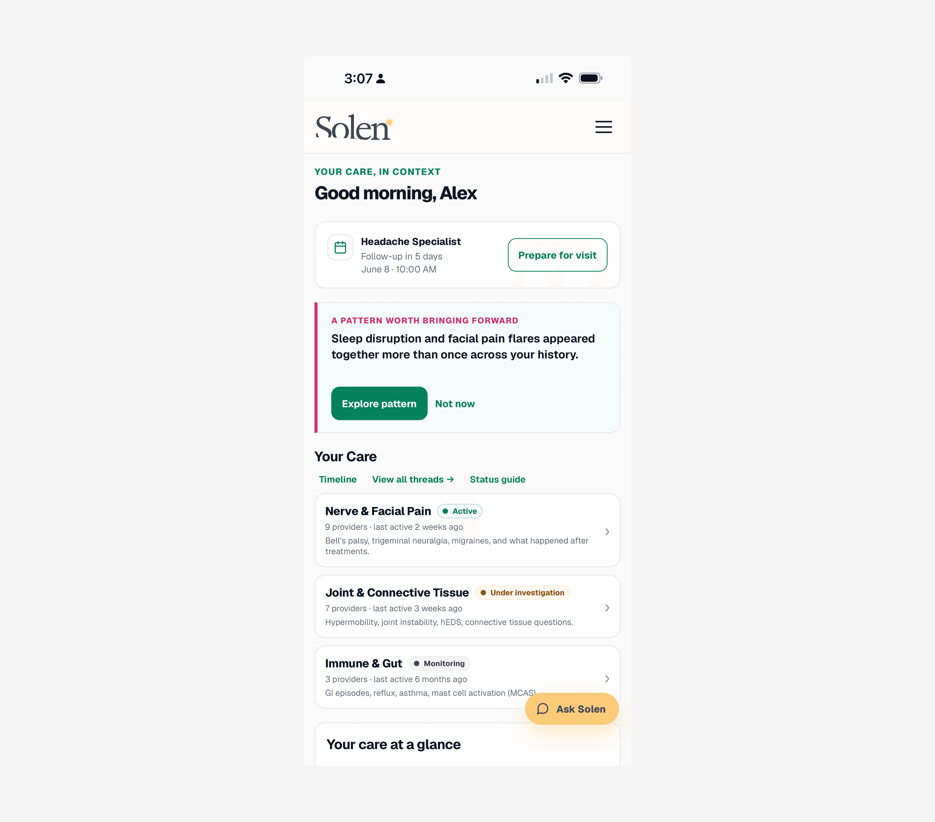
Solen's home view: the next appointment, a pattern worth discussing, and a preview of active care threads.
Why this problem matters
I began with an exploratory qualitative survey of eight people navigating long-term, undiagnosed, or undertreated health concerns, then pressure-tested the concept against a consented, de-identified diagnostic-odyssey journey. This was directional research, not a clinical study, meant to surface patterns, language, and risk before building anything.
What people were already doing
All eight participants had built their own improvised system for managing their care: paper folders, Notes app entries, spreadsheets, screenshots, calendars, medication lists, or some combination of them. None of it was designed. It just accumulated out of necessity.
"I take notes at every doctor's appointment but they are all over the place and not centralized at all."
Seven of eight described hunting through old records or acting as courier between specialists who never spoke to each other directly.
"I feel like I have to act as the courier for my own medical records."
Seven of eight also described feeling dismissed or not believed, independent of whether they'd received a diagnosis, a theme that mattered as much as the logistics did.
"We aren't just looking for a cure; we are looking to be believed."
Appointment preparation was already a survival behavior. Six of eight created some kind of pre-visit summary, question list, medication record, binder, or advocate brief on their own, without being asked to.
"Before each appointment, I write out my visit goals, symptoms, concerns, and current medications."
Capacity was never constant, though. Pain, fatigue, medication side effects, and cognitive strain made daily tracking unrealistic for many people; a product that required a perfect logging habit would become one more obligation to fail at.
The key insight
The problem was not only missing health data. It was missing context at the moment a person needed to make the next appointment count.
That shifted the concept away from a generalized health dashboard and toward something episodic: a tool built around the visit, not the day.
Job to be done:
When I have an upcoming appointment, help me understand what matters, what I have already tried, and what questions I can bring, so I don't have to start from scratch again.
Where this sits in the landscape
Before committing to this direction, I checked whether the concept already existed in some form. "Nothing like this exists" is rarely true in health tech, and it's a claim worth testing rather than assuming.
Pattern-surfacing from a health history is already an established category: apps like Bearable, Chronic Life, and Human Health find correlations across symptoms and export a doctor-visit summary. But they all depend on daily logging, which runs against the capacity finding above. Solen's patterns come from what's already documented in a person's existing care history, not a new tracking routine.
Differential-diagnosis reasoning tools also exist. Isabel, VisualDx, and similar clinical decision-support software are built for clinicians; the patient-facing versions typically generate a ranked list of likely diagnoses, the symptom-checker model this concept deliberately avoids (see "Not a symptom checker" below). I found no patient-facing tool that makes the reasoning process itself legible without stating a conclusion.
"Diagnostic odyssey" is a well-established term in rare-disease research and advocacy, not a phrase coined for this project. I found no consumer product built specifically to address it through reasoning transparency; what exists nearby is either clinician-facing training software or general chronic-illness trackers built on daily logging.
The honest conclusion: no single piece here is unprecedented. What's genuinely uncommon is the combination: patterns drawn from existing history rather than new tracking, reasoning made visible without ever producing a diagnosis, and the whole experience framed around preparing for a conversation rather than replacing one. That combination, not any one feature, is the actual bet this concept is making.
Research changed the architecture
1. Threads became the primary view
A conventional timeline is useful, but a long clinical history becomes hard to read as one uninterrupted sequence of events. Participants described their care as overlapping concerns: pain, fatigue, digestion, sleep, joint issues, medication effects, and more.
Design response: Solen groups related events into patient-readable Threads, such as Nerve & Facial Pain, Joint & Connective Tissue, Immune & Gut, and Energy, sleep & dizziness.
Each thread carries an intentionally simple status: Active, Under investigation, Monitoring, Ruled out, or Not yet connected. That last state matters. It gives a person an honest place for something they're living with but that no provider has yet connected or "owned." (Two of these names came from retesting: the original "Open" was misread by the participant as "already diagnosed," so it became Active, and "Open / unconnected" was simplified to Not yet connected.)
2. The experience became episodic rather than daily-tracking-centered
The research revealed a mismatch between conventional health-app engagement models and real capacity. People wanted help at consequential moments, not another routine to maintain.
Design response: The product prioritizes high-value moments: preparing for a visit, capturing a change, discussing a term, and carrying unresolved questions forward. It should still be useful after a gap of weeks or months.
3. The product raises questions, not diagnoses
People wanted help identifying what to ask and which details might be relevant. But an AI product that presents conclusions as diagnoses creates clinical, ethical, and trust risks.
Design response: Solen surfaces documented history, possible connections worth discussing, plain-language definitions, and questions a specialist may help clarify. It consistently distinguishes what happened from what remains open.
Uncertainty isn't a disclaimer at the bottom of the experience. It's part of the interface.

Threads group a fragmented history by concern instead of by date, so overlapping conditions read as one story instead of twenty.
The prototype
The prototype follows a clear, practical progression:
Home → Thread Detail → Specialist Lens → Doctor Prep
A conversation entry point and a Patterns to Discuss layer support that primary journey. The experience moves from continuity, to context, to action.
1. Home: make the burden visible
The home view leads with what's actually next: the upcoming specialist visit and a single Prepare for visit action, followed by a pattern the system noticed and thinks is worth bringing forward, then a compact preview of the person's active threads. A persistent Ask Solen button stays available throughout the app, so a person can talk something through, capture a change, or understand a term the moment it comes up, without a chat prompt competing with the more consequential things at the top of the page. An earlier version opened with that prompt instead; testing showed it read as the thing to do first, when the appointment and the pattern were the more urgent story.
The purpose is structural validation: this is a lot to hold alone.
2. Your Care: one page, two ways to read the same history
An earlier version treated Threads and Timeline as separate destinations, each with its own place in the navigation. That split added a decision before someone had even oriented themselves in their own history, so the prototype now merges both into a single Your Care page with two tabs: By concern and By date.
By concern is the default way to make a long history readable. It groups relevant events, providers, and unresolved concerns by the issue a person is actually trying to understand.
By date is there when chronology is the useful question. It shows the full history, windowed to the most recent two years by default with earlier ranges a tap away, and each event is tagged with its thread so the two views stay connected. Events include conventional care, self-sourced care, tests, procedures, and patient-reported changes, since people often assemble their own care path outside a formal referral chain. By-concern grouping, in contrast, pulls from the entire history regardless of window; a connective-tissue thread may reach back decades.
Selecting a thread opens its Thread Detail: the thread's status, every provider who touched it, and its encounter history in one place, including self-found care and treatments that made things worse. This is where the thread stops being a label and becomes a legible story, and it's the doorway to the Specialist Lens.
The design treats self-sourced care as first-class context rather than "other" care. From the patient's point of view, it's all part of the same effort to get better.
3. Patterns to Discuss: raise a possible connection without claiming a cause
The Patterns to Discuss view is intentionally cautious. It doesn't tell someone that sleep disruption, facial pain, fatigue, or another cluster has one explanation. Instead, it identifies a pattern that appeared across multiple parts of the history and explains why it might be worth bringing forward.
The screen makes four things visible: the observed pattern and related care threads, the events and timing that caused it to surface, what has already been explored, and what remains uncertain, including what could make the pattern less likely.
The "Why am I seeing this?" explanation makes the system's reasoning inspectable:
Solen found events in more than one part of your history that happened around the same time. It does not know whether they have the same cause.
That decision is central to the concept. A plausible pattern should become a better conversation, not false certainty.
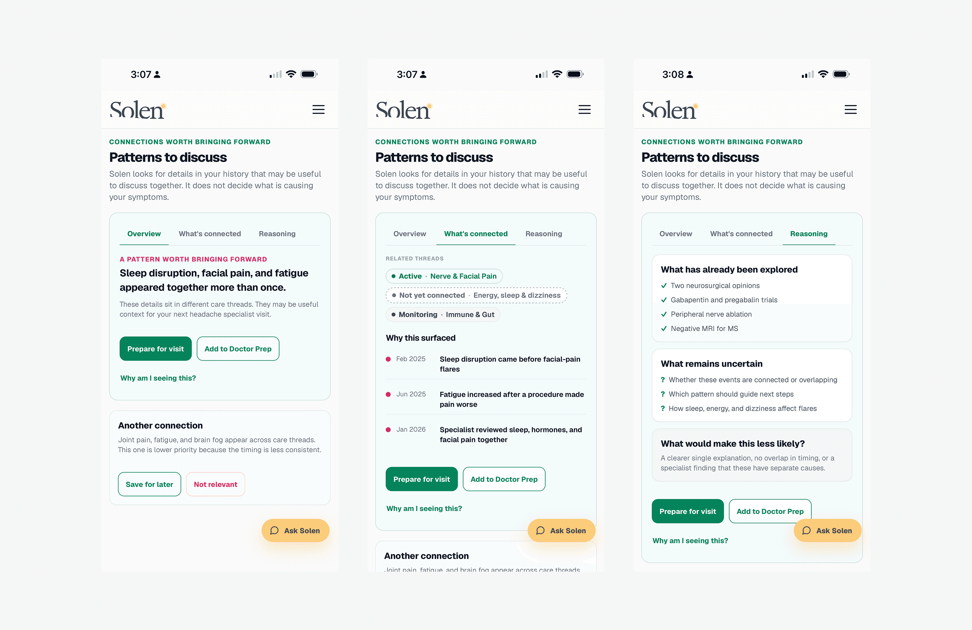
A pattern the system noticed, and the reasoning behind it, made inspectable rather than asserted as fact.
4. Specialist Lens: show how a clinician thinks, without playing the clinician
From a Thread Detail, or from Prepare for visit on the home page, the person opens the Specialist Lens for the upcoming headache-specialist visit. This is the prototype's central interaction.
The lens is built around a conviction: doctors aren't doing magic, they're doing analysis. Rather than simulate a doctor or generate a diagnosis, it makes that analysis legible in five plain-language views:
What could explain this: the parts of the story a specialist may compare together, and the big question they add up to
The doctor's checklist: the open questions a picture like this invites
Your questions: editable prompts the person can bring into the conversation
Your history: a short, visit-relevant sequence of treatments, events, and prior care
Words to know: inline definitions for clinical language that may come up
"What could explain this" opens first and is the default view. An earlier version led with the checklist instead; a persona pressure-test and a real retest both showed the "oh, that's it" moment came from seeing how the pieces might fit together, not from a list of questions to answer.
Each item in the doctor's checklist has two parts: the open question in plain language, and what would help tell things apart, the distinction that would move the question forward. A failed treatment, for example, is presented not as a setback but as diagnostic data: what it rules out.
One guardrail from earlier iterations is held deliberately. The framing is "clinical reasoning for this pattern," not "what a specialist would ask." An earlier version personified a single imagined clinician, which implied a fake authority, so the reasoning is presented as a system behavior instead.
This is the core design move:
Make the questions and distinctions visible without manufacturing the answer.
The intended effect is participation. A person who understands what their specialist is trying to figure out can contribute timing, triggers, and treatment history as evidence, instead of re-telling their story and hoping the right details land.
Retest: validating the redesign. The checklist originally opened with a numbered sequence ("Question 1 of 4") and a toggle that reframed each question in clinical language. Both worked against the goal: the numbering read as a quiz, and the toggle implied a conclusion was coming rather than a question being framed, so both were cut. A short async retest with the person whose real diagnostic-odyssey history informed this prototype confirmed the change:
"One pattern or separate problems - questions whether my issues are related or not." (describing the lead tab in almost the same words as the interface itself)
"I didn't feel like I was being quizzed, just information synthesized." (confirming the numbering removal landed, unprompted)
That's a small sample and a directional signal, not a validated outcome, but it's the first evidence, from the person the prototype was built around, that the reasoning-first structure reads the way it was designed to.
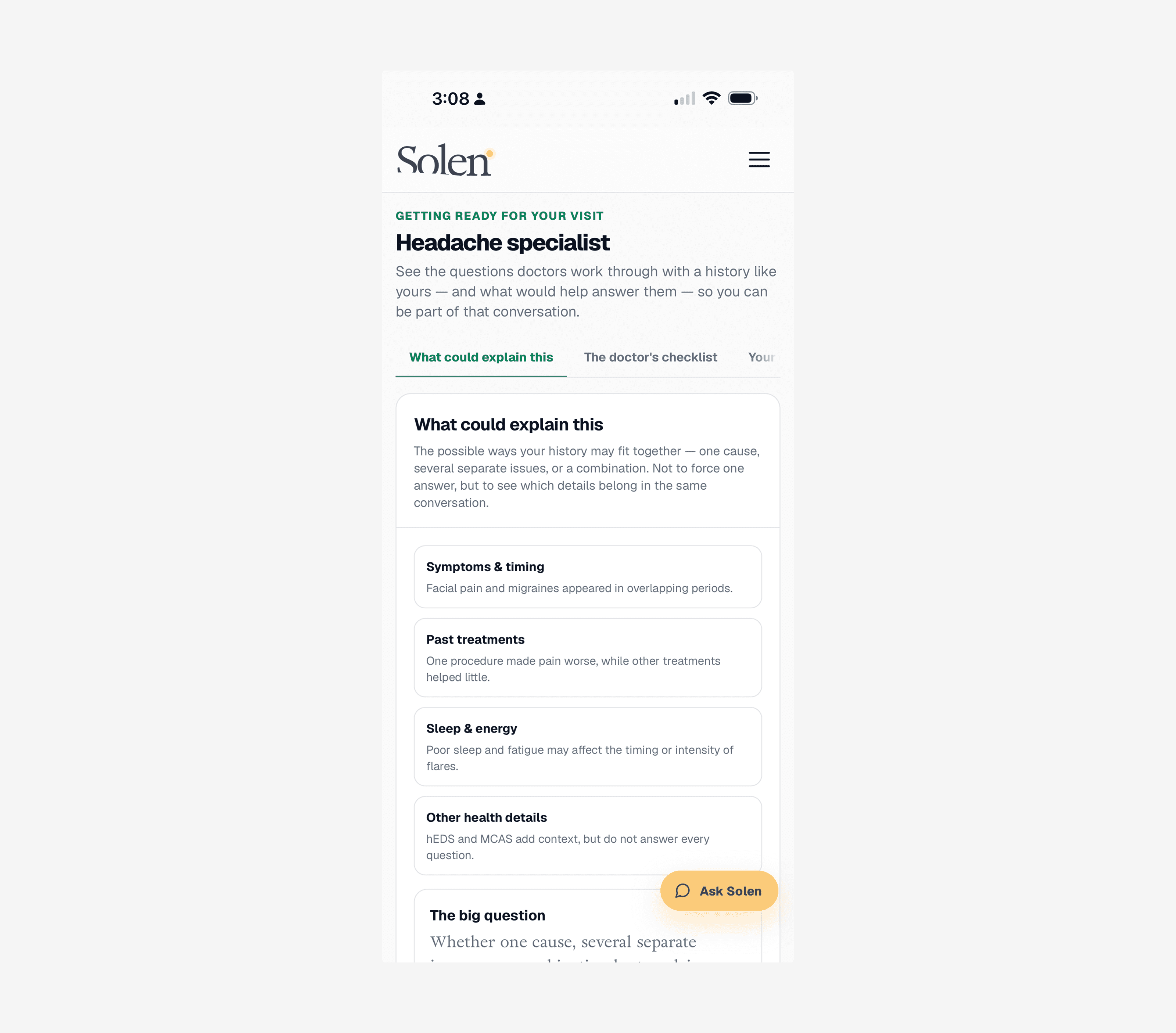
The lens opens on how the pieces might fit together, not a numbered quiz. That change came after real-user testing showed the quiz framing was backfiring.
5. Doctor Prep: turn complexity into a usable brief
The last step is a focused, editable preparation brief for the next appointment.
Rather than exporting a giant health summary, Doctor Prep gives the person a short structure for the conversation: why this visit matters now, questions they want to discuss, key history to share, a space for their own goals, reminders, or notes, and a print or save-PDF option for the waiting room, a caregiver, or a clinician who wants to read ahead.
The brief is designed to reduce the mental load of reconstructing a complicated story in a time-limited appointment. It doesn't tell a clinician what to do; it helps the patient arrive with context, language, and a clearer starting point.
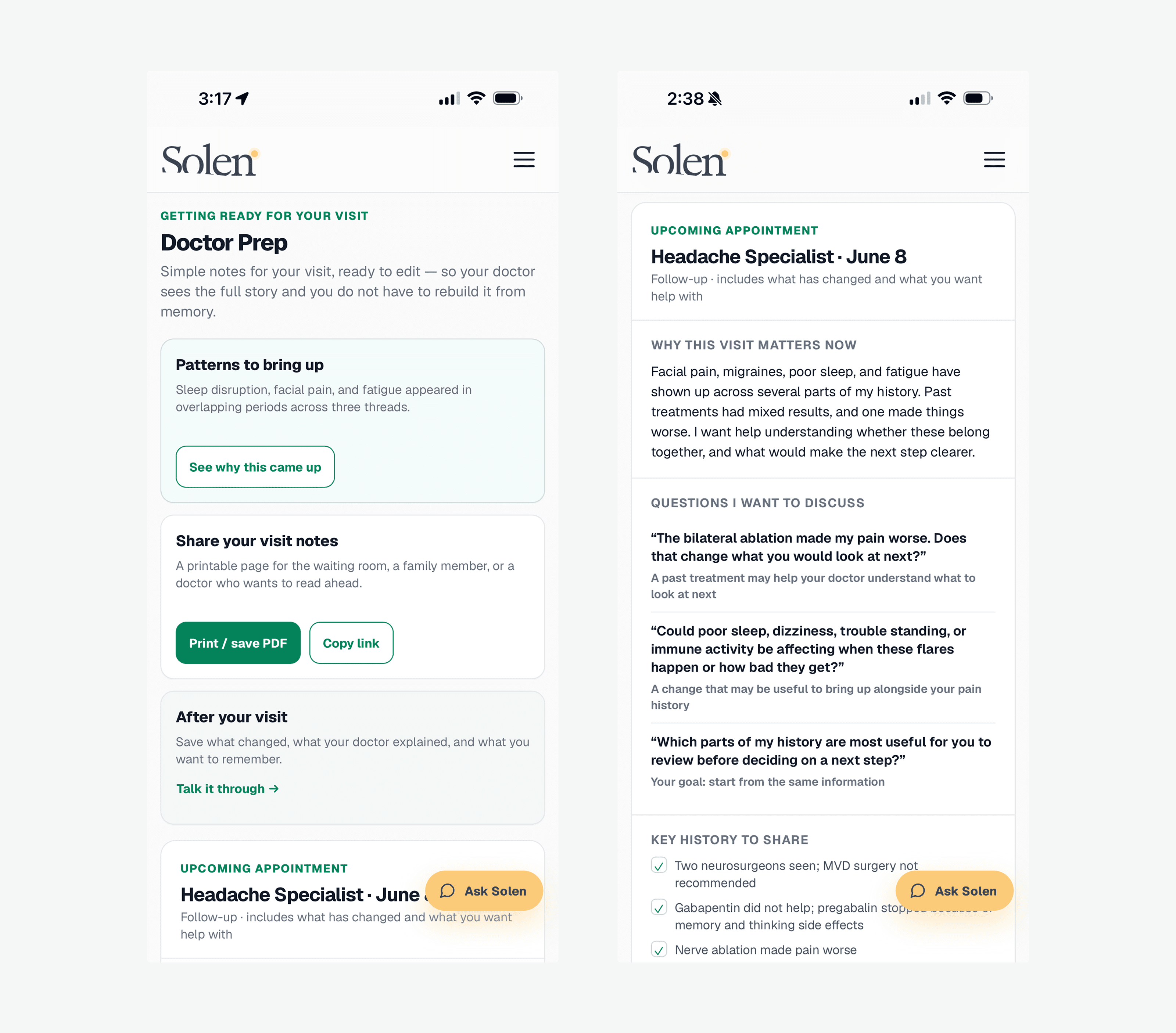
A short, editable brief instead of a giant export: questions, key history, and space for the patient's own notes.
6. Conversation: meet the person where they are
The conversation modal gives people several low-friction starting points: understanding a term, deciding whether to save a change, or preparing for an upcoming appointment.
The content demonstrates a deliberate safety posture. It explains terms in plain language, labels patient-reported events as such, and routes the person toward a relevant action (save it to a thread, add it to Doctor Prep, or keep it as a private note) without ever framing the output as medical advice.
7. One system of meaning: simplify once, then let it run through everything
The audience for Solen includes people who are older, exhausted, and managing illness on their hardest days. Everything is written to a high-school reading level, on the principle that no one should need product vocabulary to understand their own care. Late in the prototype's development, two sweeps enforced this everywhere at once.
The language sweep. Internal vocabulary had leaked into patient-facing copy, and each instance was replaced with the word a person would actually say: "Encounters" became visits, a "patient-reported event" became something you noticed, in your own words, and a lens section titled "Drivers, or bystanders?" became "Is poor sleep making things worse?" The discipline cuts one way only: clinical terms a long-term patient has genuinely earned (hEDS, MCAS, gabapentin, ablation) stayed, since flattening them would be condescending, while everything about the product itself stays plain.
The meaning sweep. Color had started to accumulate accidental meanings. The same pink marked both "a pattern worth bringing forward" and, arbitrarily, one particular thread. The fix was a small set of rules, applied without exception:
Color never identifies a thread. Threads are named in text; their color comes from their status.
Status is one component everywhere. A dot-and-label chip (Active, Under investigation, Monitoring, Ruled out, Not yet connected) appears identically on thread cards, thread detail, timeline events, and pattern cards. Ruled-out threads add a strikethrough, so the line tells the story on its own. Every chip is also tappable, opening the plain-language legend in place, so the explanation lives on the thing itself and not only behind a link.
Pink means exactly one thing. Solen noticed a pattern across threads. It appears nowhere else.
Timeline markers carry event weight, not identity. A neutral ring for a visit, amber for a setback, green for a breakthrough, outlined rather than filled, so they never compete with status dots.
A single plain-language legend, "What do the statuses mean?", documents the entire visual language and is reachable from every screen where statuses appear. It ends with the sentence that keeps the system honest: you set these; Solen never decides them for you. Every text-bearing color pair was contrast-verified to WCAG AA against the design system's tint scale, a floor rather than a nicety for an audience with higher-than-average rates of low vision.
The payoff of both sweeps is the same. Once a word or a color means one thing, it means that thing everywhere, and the person never has to relearn the interface from screen to screen.
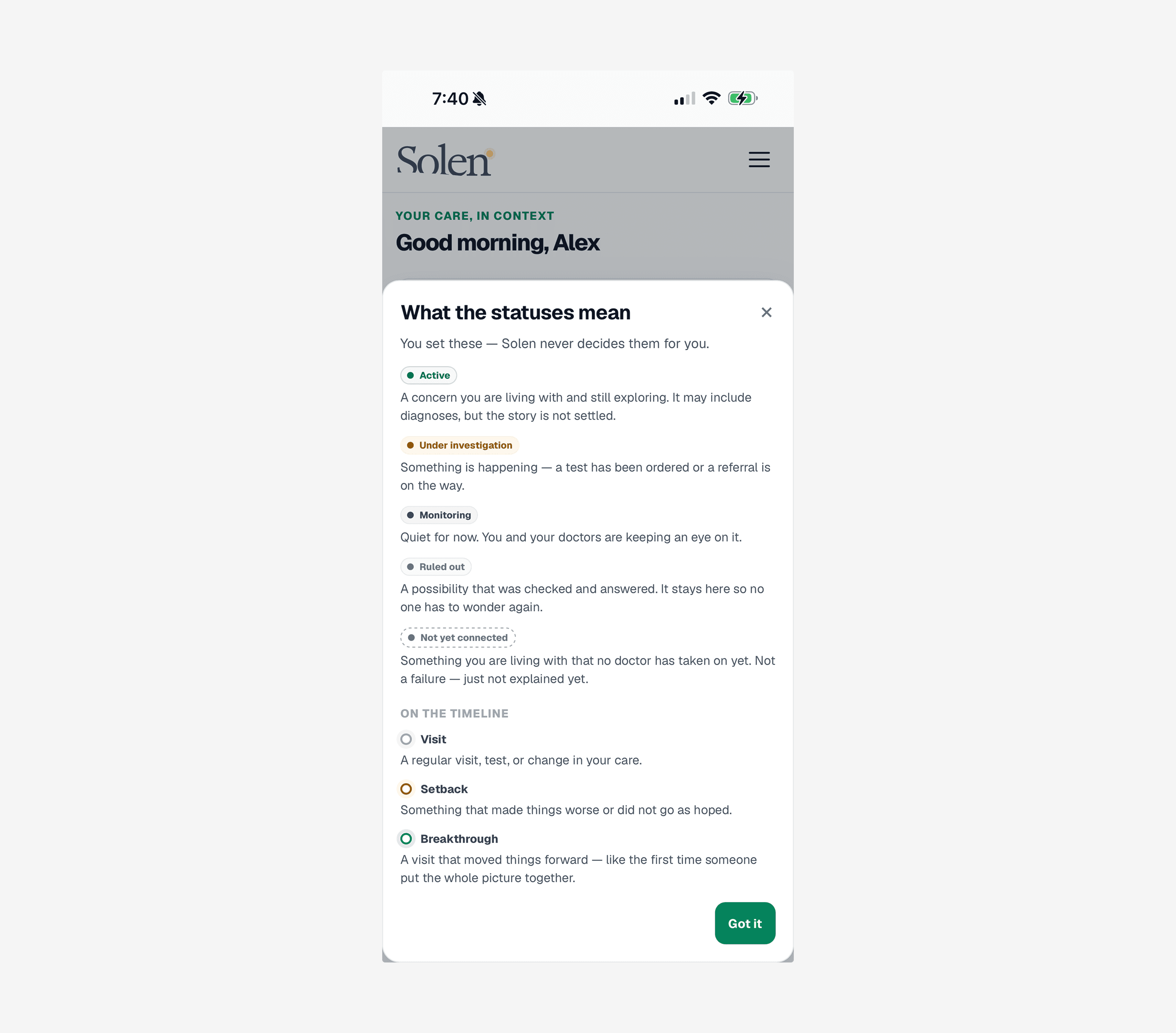
One legend documents the entire color and status system, reachable from every screen where a status appears instead of buried in a help menu.
Design principles
Show the questions, not the answers. Solen makes reasoning more legible without substituting its judgment for a clinician's.
Respect the patient as the integrator. The system acknowledges the coordination work people are already doing rather than treating them as passive recipients of care.
Design for capacity range, not a user's best day. Every interaction should create value in a short, low-energy session. No streaks, guilt-inducing reminders, or daily-log assumptions.
Make uncertainty visible. The interface distinguishes documented events, open questions, and patterns worth discussing instead of presenting artificial certainty.
Use plain language without flattening complexity. Medical terminology is defined in context, while the user can still see the specific detail and question behind it.
Support participation, not confrontation. Visit preparation should help someone collaborate with a clinician, not arm them for an adversarial interaction.
The hard decisions
Not a symptom checker
Starting from symptoms can invite an anxious loop of searching for possible causes. In Solen, a symptom belongs in an existing care thread or becomes an open, unconnected concern that can be carried into a conversation.
Not a daily wellness tracker
Daily upkeep is a poor fit for people managing variable pain, fatigue, and cognitive load. The value proposition is continuity at high-stakes moments, not habit formation.
Not a generic AI chat experience
A chat interface alone can sound helpful while leaving the person with nowhere to put what they learned. In Solen, conversation is an entry point into a structured care record and a concrete next action.
Not a simulated care team
A fictional panel of doctors creates the appearance of authority without earning it. The product expresses clinical reasoning as a system behavior: what details could be useful, what remains uncertain, and what a person may want to ask. Not a verdict from a virtual clinician.
Not a promise of resolution
Clinical reasoning is probabilistic. The product can help a person prepare, notice, and communicate. It cannot guarantee a diagnosis, treatment, clinician receptivity, or outcome.
What I would validate next
This is a concept, so I'm not presenting adoption, clinical, or business outcomes that don't exist. The next phase would focus on the decisions that matter most:
Does Threads reduce cognitive load better than a conventional chronological record, and do people understand the difference between a documented event, a pattern worth discussing, and a medical conclusion?
Does the Specialist Lens help people identify useful context without increasing anxiety or creating false confidence? (Early signal: see the retest in "Specialist Lens" above. Directional, not conclusive.)
Do people return before appointments without being asked to maintain daily data?
Does Doctor Prep reduce the burden of preparing for a visit, and can a clinician read it quickly without it becoming another long patient-generated document?
Does the conversation entry point create a meaningful path into structured actions, rather than becoming a dead-end chat experience?
The strongest behavioral signal wouldn't be "I wish I had this." It would be a person replacing an existing binder, Notes-app record, screenshot folder, or pre-appointment ritual with the product.
Outcomes
Shipped a working prototype spanning Home, Your Care, Patterns to Discuss, Specialist Lens, Doctor Prep, and a conversation entry point
Redesigned the Specialist Lens checklist after a retest showed the original numbered format read as a quiz; the retest confirmed the fix in the user's own words ("I didn't feel like I was being quizzed")
Renamed the "Open" status to "Active" after retesting showed it was misread as "already diagnosed"
Merged Threads and Timeline into one page with two tabs, cutting a navigation decision that was adding friction before someone had even oriented themselves
Validated the core safety framing directly: the real source user described the product back as "not a diagnosis, just makes me aware of how the issues I'm having might be tied together"
Reflection
Solen began as an exploration of fragmented care records. Research turned it into a more focused question about agency.
The design challenge wasn't to make a smarter medical dashboard. It was to decide what a product should never pretend to know, then find a credible way to help someone arrive at the next conversation with more context and less burden.
When the system cannot hold the whole picture, the patient ends up holding it. Solen explores how design can make that responsibility more manageable, without claiming to replace the people responsible for care.
Finding the right name
As the product matured, Care Map came to describe a feature rather than the experience. Through several rounds of exploration, I moved away from healthcare terminology toward the emotional outcome of the product: helping people make sense of a confusing health journey. That meant testing hundreds of name concepts against the product vision, memorability, and long-term brand potential, not just healthcare fit.
The result was Solen, a simple, distinctive name that doesn't describe healthcare but creates a feeling of clarity and confidence. Like the product itself, the brand is designed to reduce complexity rather than add to it.

Solen. The final identity reflects the product's goal: helping people understand their health story with greater clarity and confidence.
Have questions about the workflow, the prototype, or the design decisions? Happy to walk through it live.
Research and prototype note This is independent, non-clinical concept work. Research included an eight-person exploratory qualitative survey conducted in May 2026 and a consented, de-identified follow-up used to pressure-test design assumptions. Prototype content is fictionalized and composited to protect privacy. Solen is not a medical device, clinical decision-support tool, diagnosis product, or treatment recommendation system.